There comes a point in our life when we need to adjust to the certain changes. This could be something related to your work or this could be your growing family. When this happens, we might need additional space for the home.
What would we do?
Others move to a bigger space since their current home is no longer fit to their condition. Some would just upgrade their existing space by adding an extension.
This is what Australian architecture firm Carter Williamson did to the Screen House. The owners wanted additional space in their house and so, they extended their home.
But it is not just an ordinary project.
Instead of adapting to the design of the existing home, the extension actually has its own impressive look. The designers used bold black colors in the interior combined with wood.
The result?
A beautiful modern space that is both appealing and functional! Let us take a look at the Screen House below.
Location: Sydney, Australia
Designer: Carter Williamson
Style: Contemporary
Number of Levels: One-storey
Unique feature: A modern interior of an extension from an old cottage. The space features the combination of black and wood which gives it a bold appearance.
Similar House: Before and After Interior Update With Wood and Black Colors
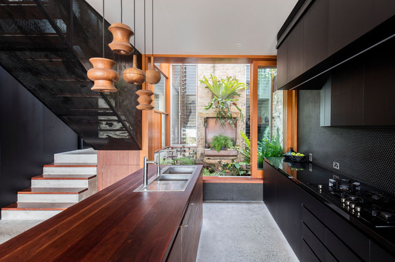
This new extension of a cottage in Sydney, Australia is indeed impressive. Notice how the old cottage looks as seen in the image and how stunning the modern extension is! I can just imagine how it would feel to get into this space like you are in another home already.
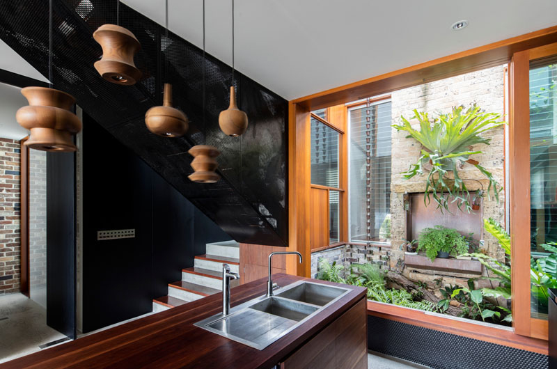
In this picture, you can see the old cottage where the extension is connected. Also seen here is a small courtyard filled with plants.
The wooden pendant lights compliment with the rest of the home because of its material. It is also one of the functional decorations that add more beauty to the interior.
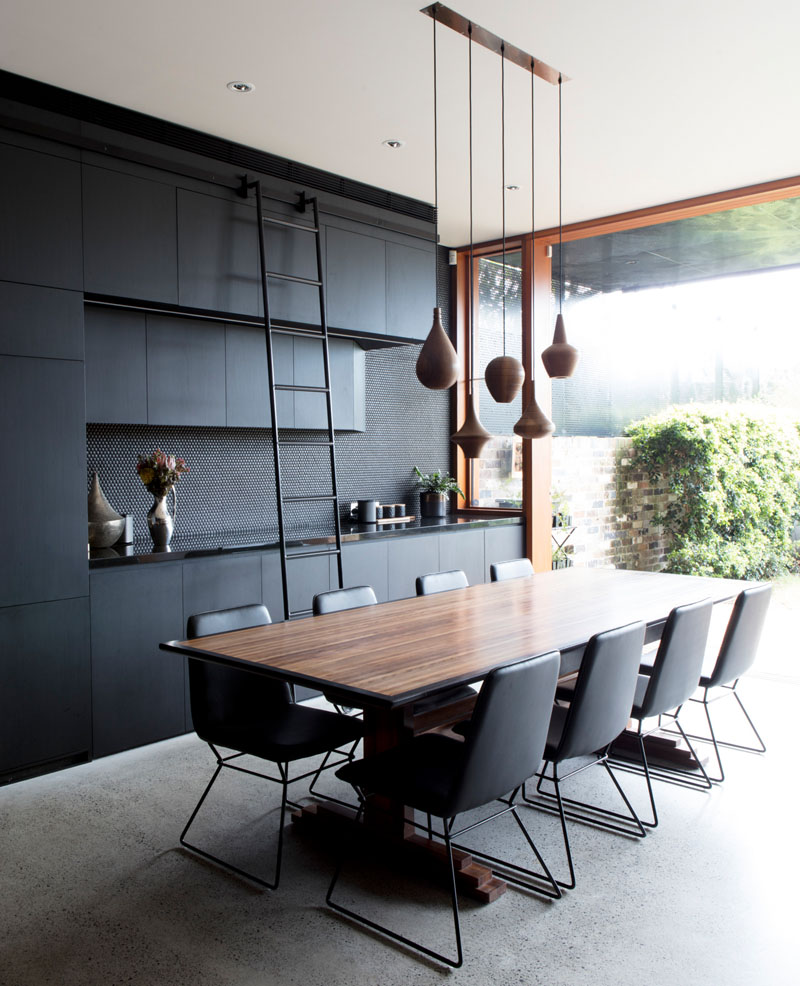
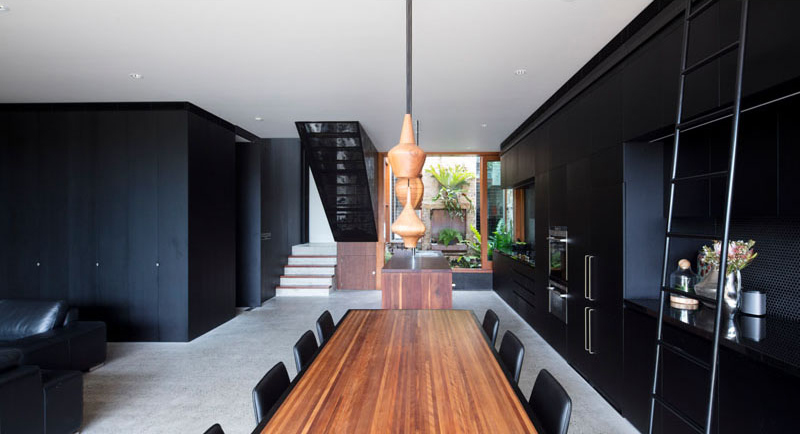
The dining area features a ladder that has been added to the cabinetry in order to provide easy access to the upper cabinets. It also adds as a decorative item too. Also seen here is a collection of simple and elegant wood pendant lights that help to anchor the dining table.
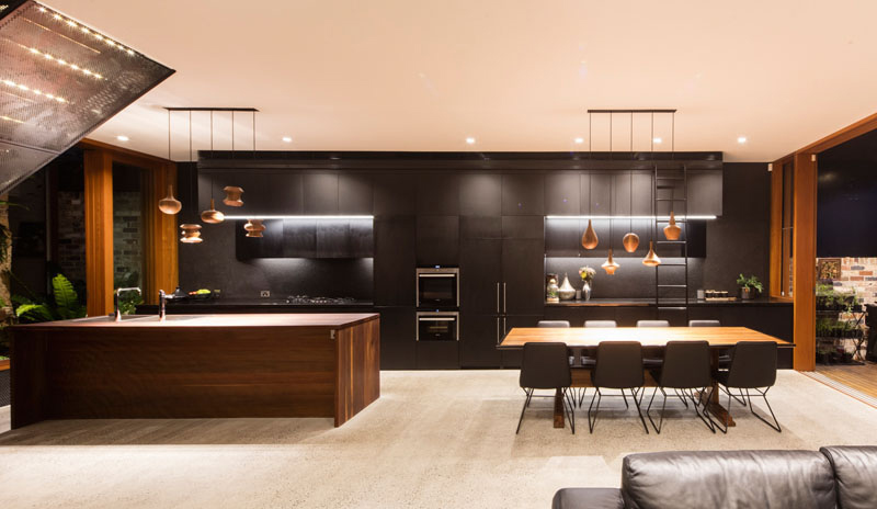
This is part of the home’s new extension featuring black cabinetry that runs the length of the wall from the kitchen through to the dining area. Also seen here is a wood kitchen island that ties in with the wood dining table and the wood window and door frames.
Read Also: The Modern Contemporary Black and White Interiors of Toorak House

Seen here is the staircase that is located by the kitchen. It leads to the upper floor of the house where the bedrooms and bathrooms are located. For sure you will agree with me that this staircase is a beautiful centerpiece of the home.
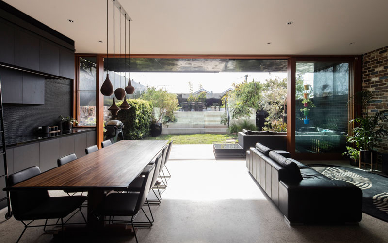
Both the dining and living areas open up to the backyard. This is made possible with the use of large full height sliding glass doors that also provide natural light to the space when closed. There is also another dining area in the backyard which sits on a raised space.
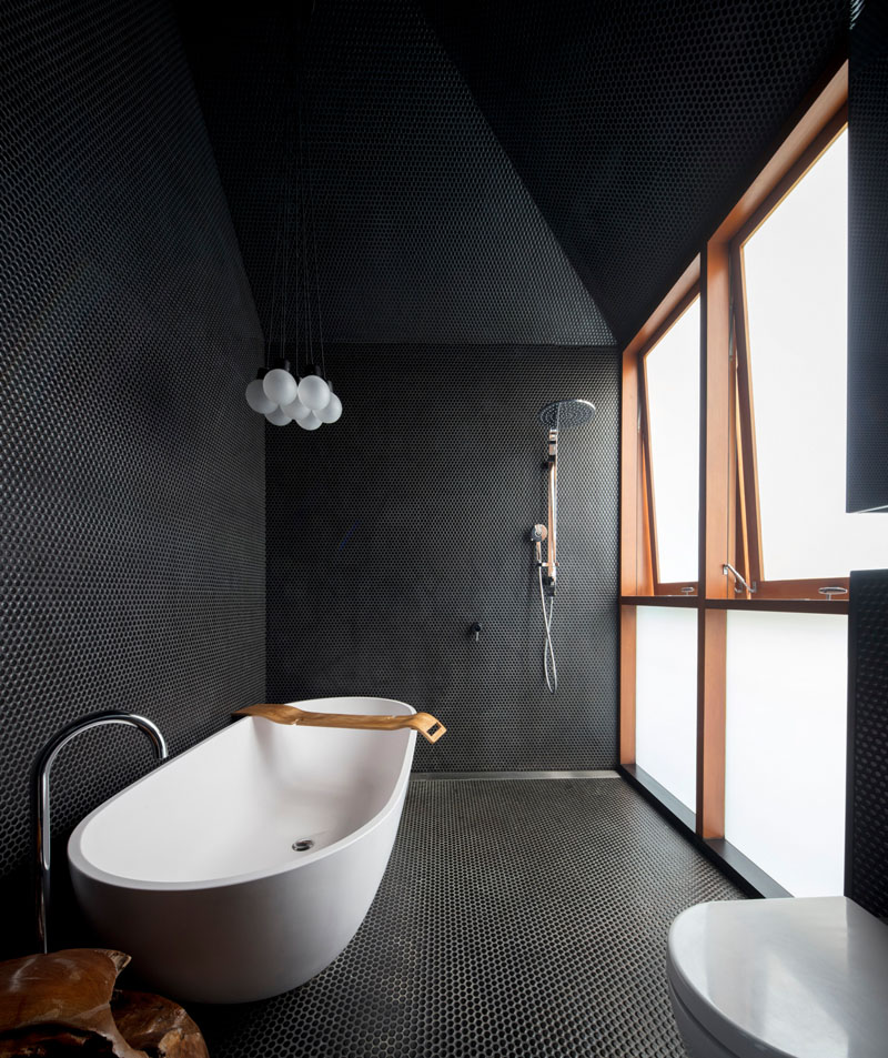
Like the rest of the home’s interior, the bathroom also has a black theme. This is located opposite the courtyard by the kitchen and by the stairs. This stunning modern bathroom features small black penny tiles that cover the surfaces and frosted windows that provide natural light into the space. If you are not a fan of this look, check out black and white bathrooms that you might prefer.
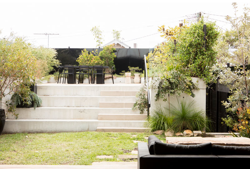
This is the outdoor dining area that we mentioned earlier. As you can see, it is located on a raised concrete which can be accessed through the stairs. Notice also that the surrounding landscape has a beautiful design and it would be very relaxing to do some activities here like reading or even dining out.
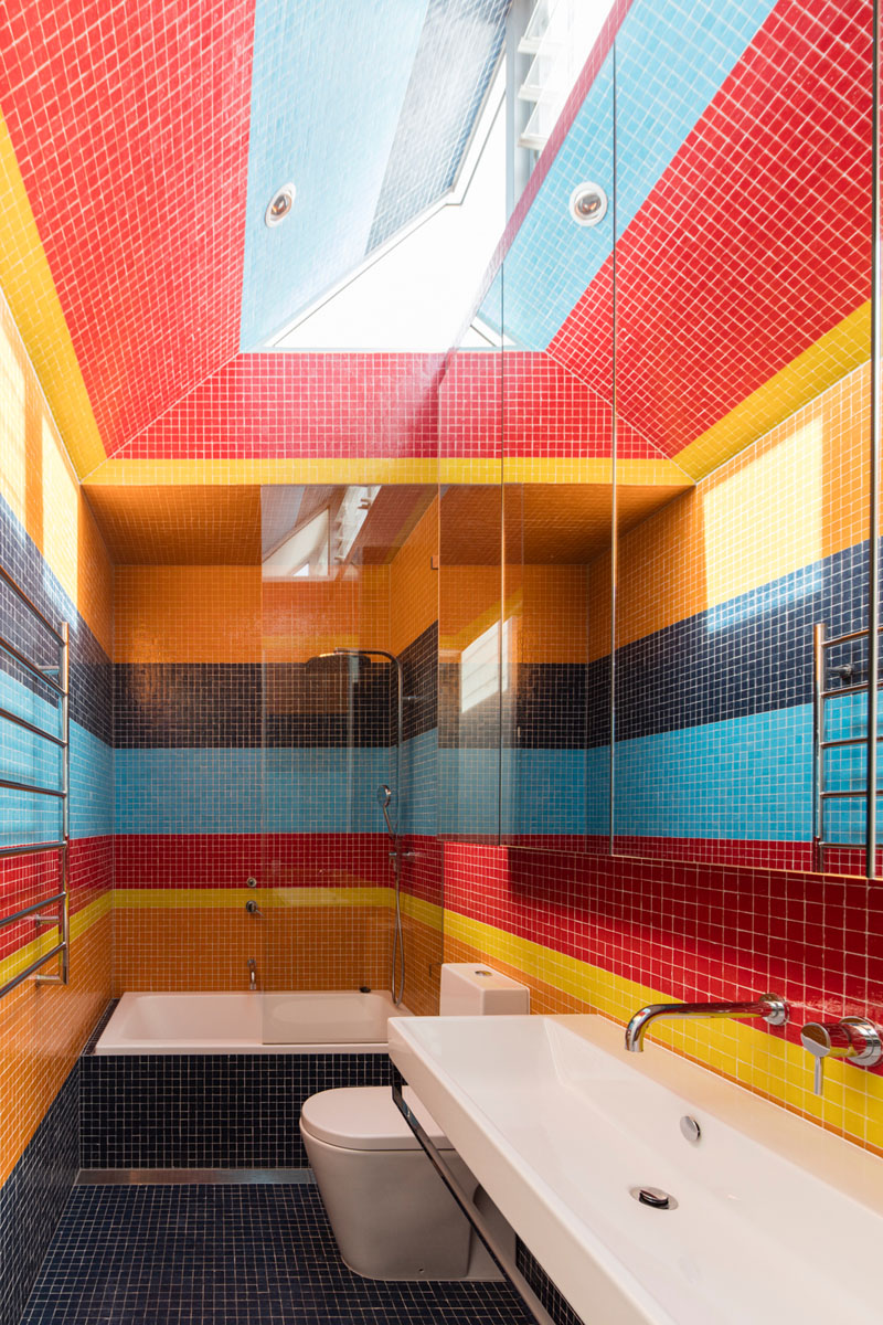
Instead of black, one of the bathrooms in the house that is located upstairs used colorful tiles. Aside from its bright colors, the tiles also have stripes in it which adds a creative appeal to the space from the walls to the ceiling. This is indeed a surprising twist from the look of the home’s other interior spaces.
The Screen House Balmain is indeed a beautiful project from Carter Williamson. The result of the designer’s creativity is no doubt impressive and it gave the owners a new space where they can do their daily home activities. But what I love most here is their usage of black and wooden materials! While others would not be open to the use of black colors, the designers of this home preferred to utilize the color to come up with a unique interior. I also love their choice of decors and accessories. Aside from that, it was a good idea to open the space to the outdoors, allowing the residents to enjoy nature’s charm. Can you tell me what certain features do you like most in this home?
Via wildecom builders feed http://www.rssmix.com/
No comments:
Post a Comment