Happy New Week, my wonderful friends! I am so glad to have you on Home Bunch today. Thank you for your visit and I hope you enjoy every minute of it! I really can’t tell you how excited I am to be featuring my friend Kristyn of @blackard_modernfarmhouse. I told her a few months ago that if I had to build a home, hers would be my inspiration. I love how airy every room feels and the layout. It’s perfect for a family with kids.
Here she explains more about her beautiful home and her style.
“Hello Friends! My name is Kristyn of @blackard_modernfarmhouse, and as I’m typing this I’m still in shock that Luciane asked me to be a part of this wonderful series. We just completed our build of a modern farmhouse in Southern Indiana, and I can’t believe how many times I referred to HomeBunch during our design process. I just hope I can pay it back by helping someone to make a decision or inspire them in someway.
If you follow me on Instagram then you know I’m very passionate about helping people through the building and design process because I know how challenging it is firsthand. I just want to inspire people to follow their gut and strive to give ideas to help make your home aesthetically pleasing but still being super functional for a young family! Another thing that will stand out is that you will probably see vintage rugs scattered throughout our home, and that’s because I own a Vintage Rug Boutique @violetvintagerugs. I love bringing that touch of old and uniqueness into people’s homes-it adds so much charm.
A little bit about us…. My husband Barry and I were high school sweethearts, endured a long distance relationship for four years, and married after we graduated college. After he attended Law School and I attended Culinary School, we moved back to our hometown and started a family. Fast forward ten years later…. we run across Studio McGee’s Windsong Project and I can still remember the moment when I looked at my husband and said “that’s our house!” We had our house for sale the next week, sold within a few days, and started planning our dream modern farmhouse. We knew we wanted the classic feel of farmhouse charm but that edginess that comes with a modern home. Most importantly we still wanted functionality for our family, while achieving the look we were aiming for. We tried to merge all three and after months of planning we came up with the design of our home. My must-haves were a light and bright feel with lots of windows so we could let the outside woods in. We also wanted an open feel, but with rooms still feeling defined.
So here we are, finally in our house, turning it into our home with our three kids, two hairless cats and a rescue dog. I hope you can gain inspiration and see our heart in this home.”
Beautiful Homes of Instagram: Building a Forever Home
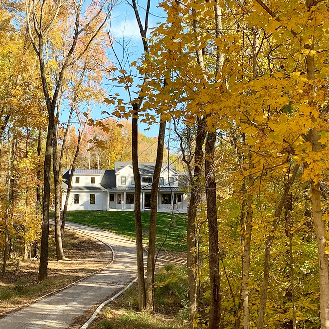
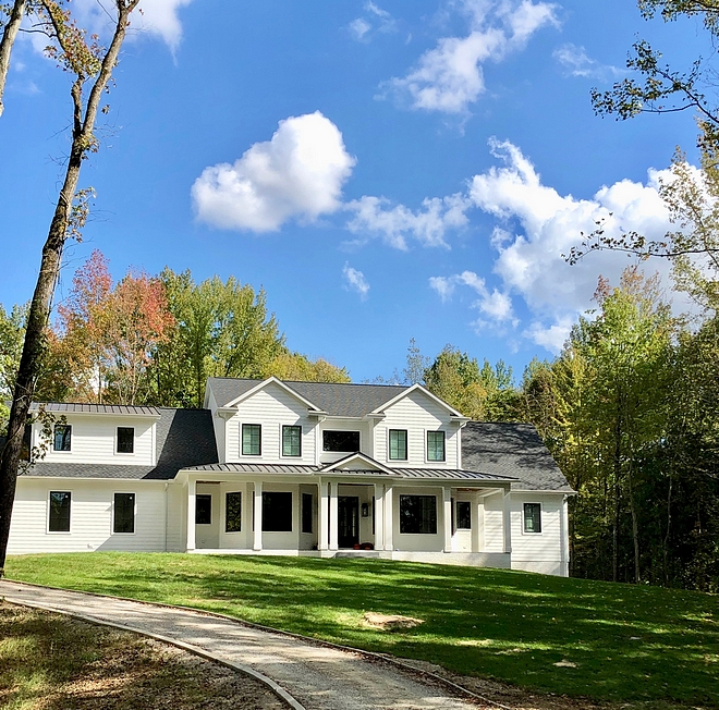
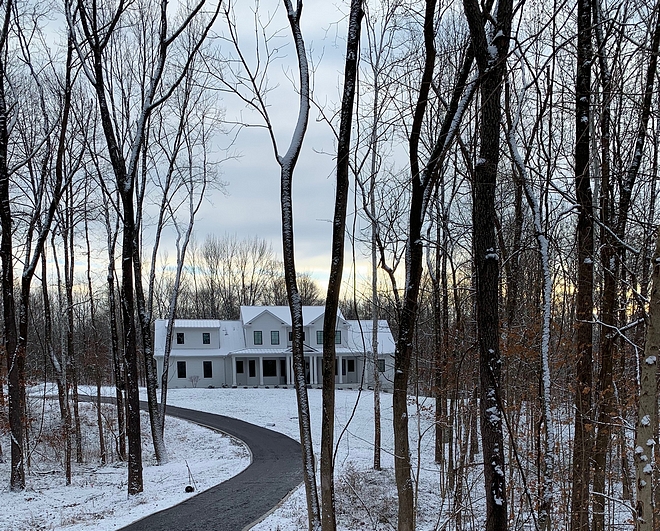
Our house is situated on four wooded acres in Southern Indiana. We love being tucked away here where it is quiet and peaceful, and honestly we don’t have shades on most of our windows because it is so private.
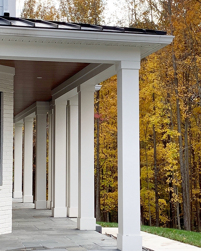
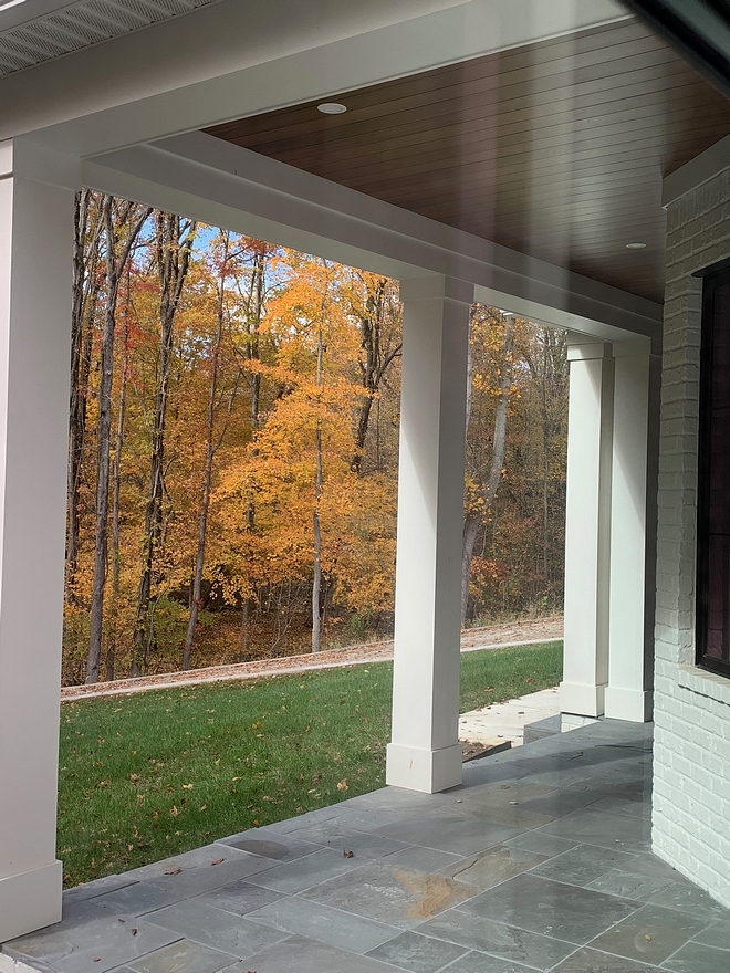
Wrap-around Porch
We knew we wanted lots of porches because we love to be outside.
Porch Columns: Boral North America.
Flooring
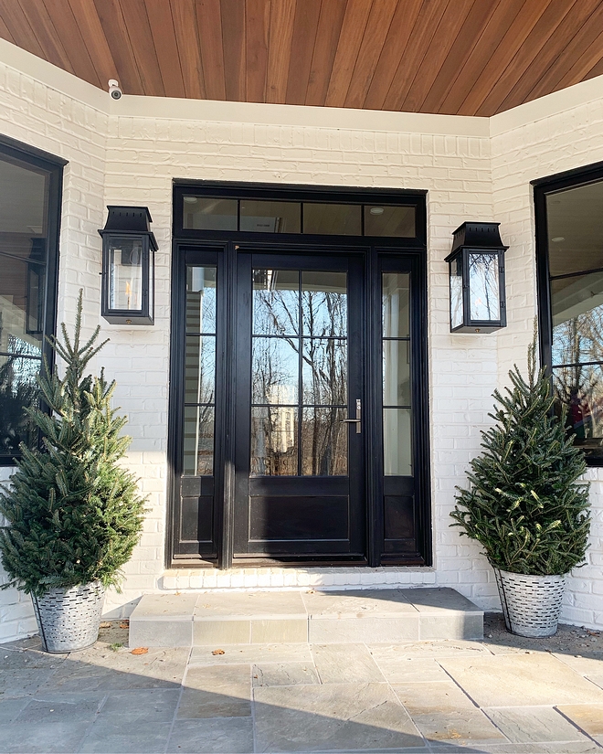
We chose Pennsylvania Blue stone for the flooring and tongue and groove stained Poplar to warm up our white exterior.
Porch Flooring: Pennsylvania Bluestone – similar here.
Porch Ceilings: Tongue and Groove Poplar stained English Chestnut.
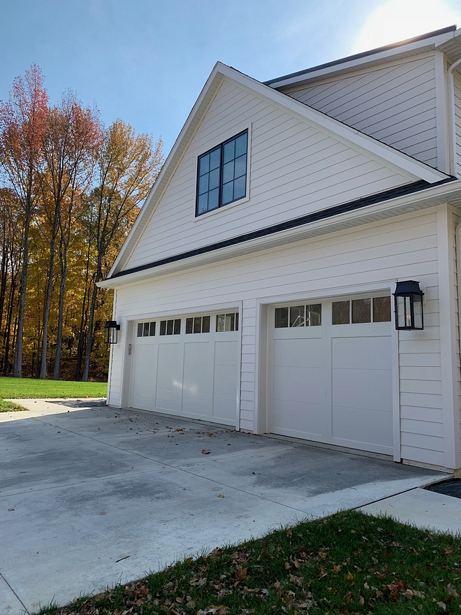
Garage Doors
Garage Doors: Clopay Coachman Doors.
White Exterior
From the beginning of designing, we knew we wanted an all white house with clean lines, but we wanted it to be a mixture of materials. We decided on Celect siding, mixed with white painted brick to add texture. We wanted black windows to add that modern feel, and mixed a traditional black shingled roof with a metal roof over the porches to add that farmhouse touch.
Siding: Celect – Premium siding from Celect Cellular Composite Siding by Royal.
Brick: Custom paint to match the siding.
All Doors and Windows- Sun Windows; Aluminum Clad on Outside and wood inside.
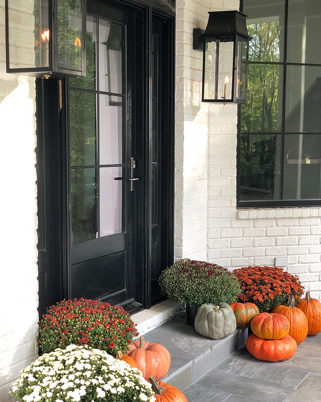
Front Door Paint Color
Black Windows and Doors Paint Color: Sherwin Williams SW 6961 Black Magic.
Exterior Sconces
We opted for gas lanterns instead of traditional lighting because we loved that rustic and romantic look that the gas lanterns provided. At nighttime, it looks magical- even from inside you can see the twinkling glow.
Gas Lights: Gas Light Pro.
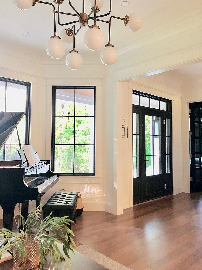
Foyer
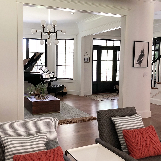
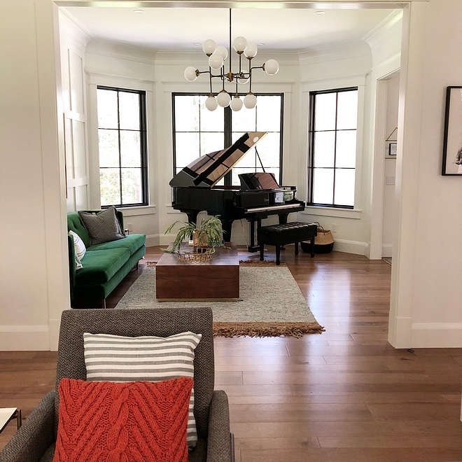
Our entry opens up into our piano room, which we also call the green couch room. Playing the piano is a passion of mine, so I knew I wanted a room dedicated to it.
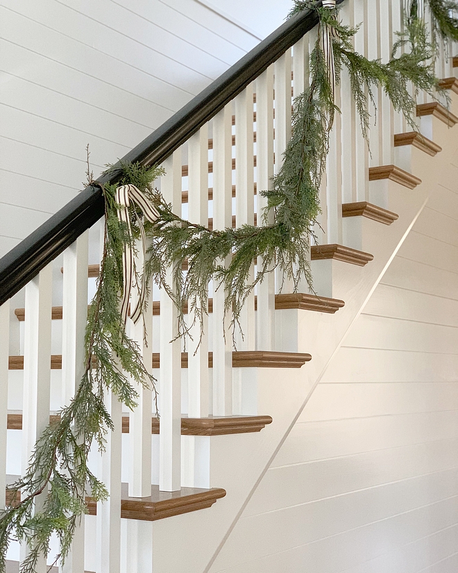
Staircase
Upon walking into our home, you are greeted with a traditional staircase with black glossy railing and shiplap walls.
I wanted a staircase that I could drape garland from each year!
Garland: Pier one – similar here.
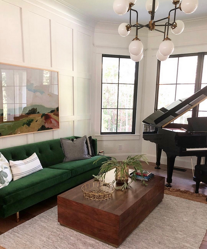
Piano Room
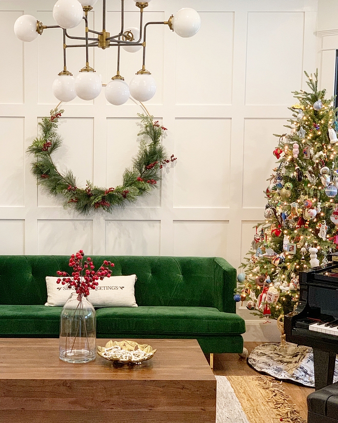
We did the grid wall to add texture and create a focal point, and added a bistro modern sconce for hints of brass and black.
Coffee Table: CB2
Artwork: Juniper Print Shop.
Couch
My favorite color is green and the second I saw this couch I knew I had to have it!
Couch: CB2.
Large Christmas Wreath: Target.
Christmas Pillows: Target.
Piano Room Chandelier
Chandelier: Restoration Hardware Bistro Globe Chandelier – similar here & here.
Rug & Piano
Piano Room Rug: CB2.
Piano: Steinway and sons Boston piano.
Living Room
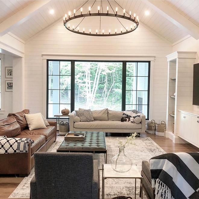
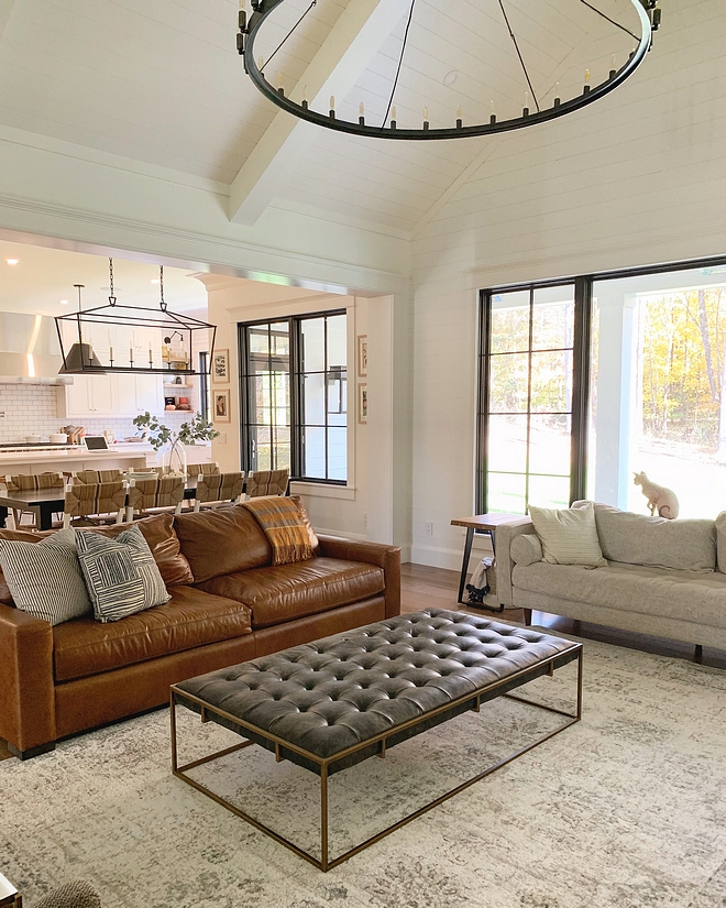
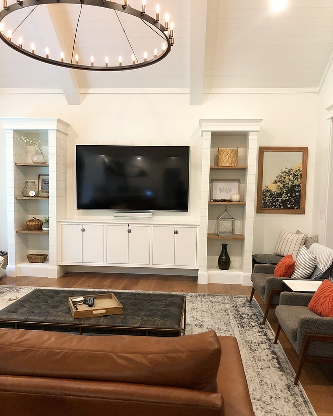
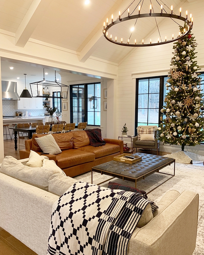
Our goal in our living room was to create a light and bright atmosphere that still felt warm and cozy. Instead of doing an originally designed two story Great Room, we changed it to a vaulted 15.5 ft ceiling covered in shiplap. We wanted the black chandelier to be a focal point, as well as the giant picture window.
Chandelier: Restoration Hardware 63″ Camino Chandelier – similar here & here.
Textures
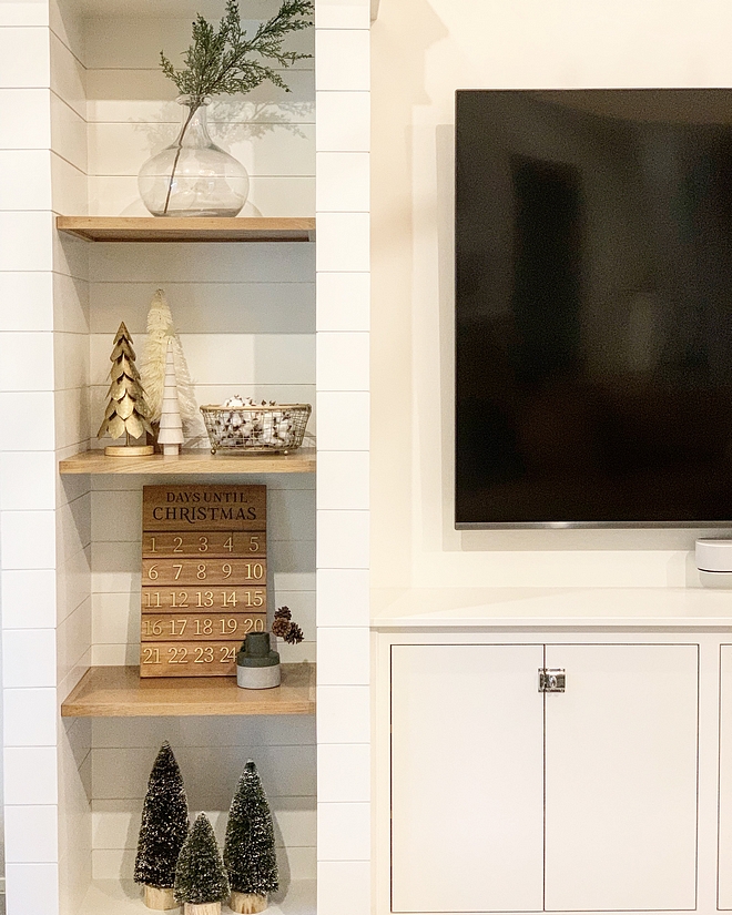
It’s really important for me to bring in lots of textures to create a cozy space. We added hickory shelves in the built ins, caramel leather couch, grey treed chairs, a black and brass ottoman, chrome hardware, striped linen pillows. I’m a big fan of mixing metals as well as materials!
Couch: Restoration Hardware – similar here, here & here (chunky look).
Leather Ottoman: McGee and Co.
Rug: Wayfair.
Media Unit
The house originally was framed with a fireplace in the living room. I walked in the day it was framed, and it just didn’t feel right. I felt like it needed more windows. The woods behind us are so beautiful I knew I wanted to see more of them! So we took the risk and moved the fireplace outside on the back porch and put a giant picture window in there. Everyday I’m so thankful I followed my gut.
Chairs: Article – similar here. Other Beautiful Chairs: here, here, here, here & here.
Storage
We definitely like to watch TV (we are a big WWE family) so we knew we wanted a big entertainment center. I wanted shelves for the pretty stuff, but also storage for tv equipment and kid toys.
Ivory Sofa
Couch: Article – similar here & here.
Checkered navy/white throw: Schoolhouse Electric.
Layout
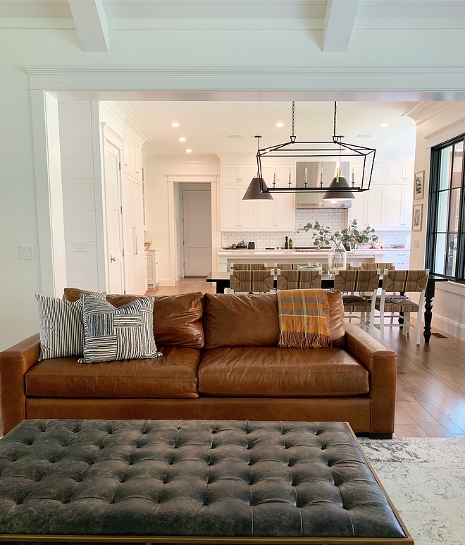
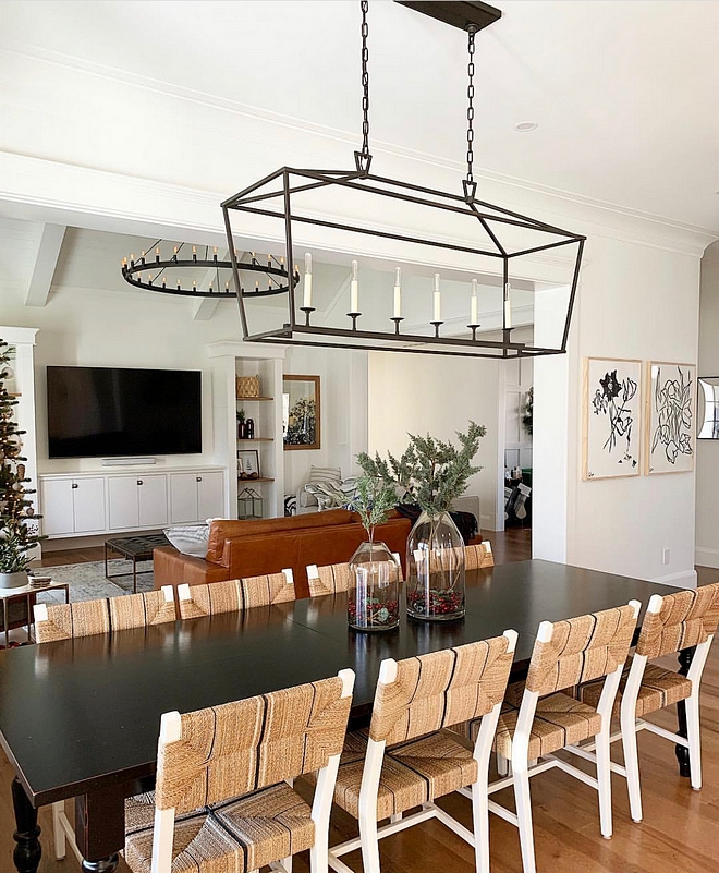
The living room opens to the dining room and kitchen.
Dining Room
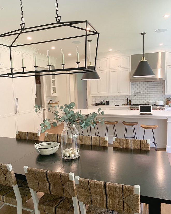
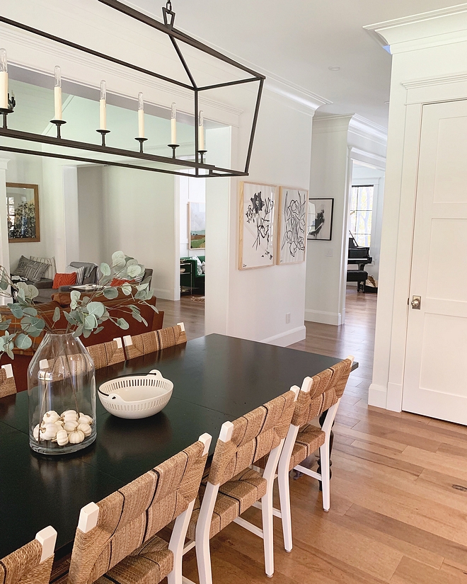
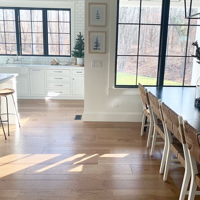
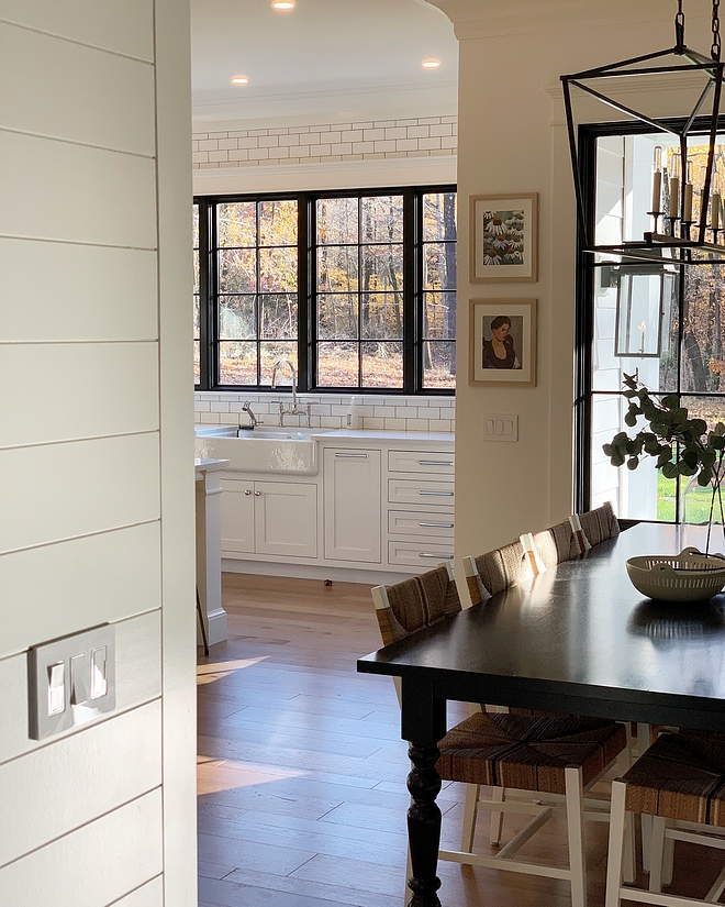
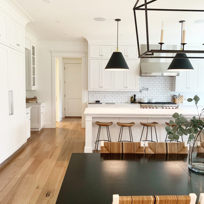
I knew I definitely wanted open concept with our home and I love that the dining table is in the middle of the kitchen and living room. Each space feels defined yet open.
Dining Chairs
Chairs – Serena and Lily.
Dining Table & Chandelier
Dining Table – Pier One, no longer available – similar here & here.
Chandelier: Visual Comfort – similar here.
Window
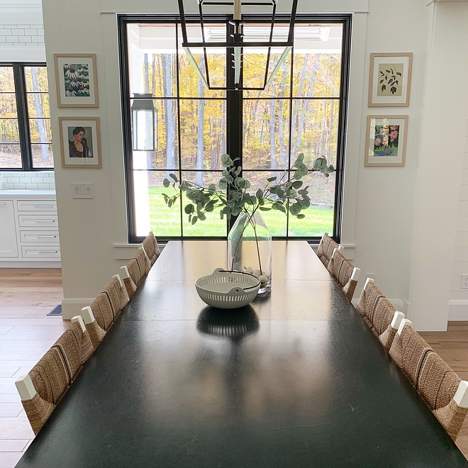
The windows open up right to the woods. It makes our entire kitchen and living room area full of natural light.
Hardwood Flooring
Wood flooring: Mohawk Engineered Hickory, Sawbridge – unfortunately they are discontinued – similar here.
Naturally Beautiful
If you follow me on Instagram, then you know this area gets so much natural light and it is my absolute favorite thing about our home!
Kitchen
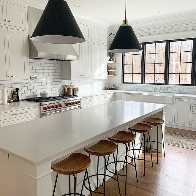
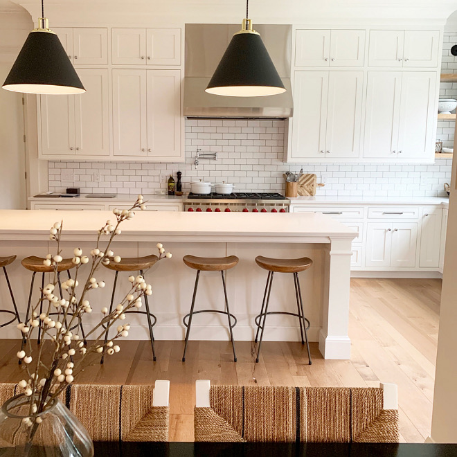
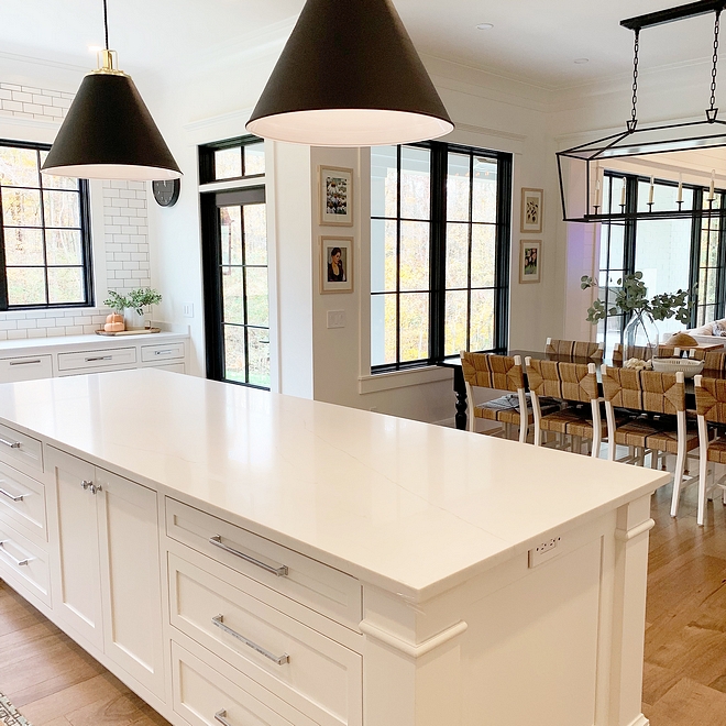
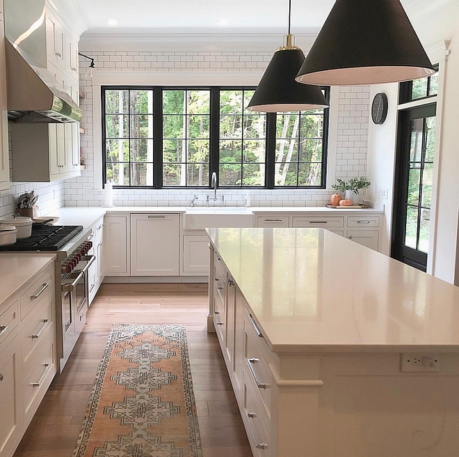
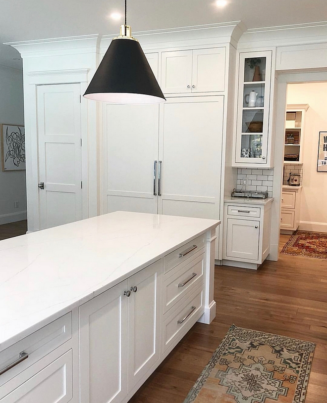
The kitchen was the most important place to me, because before I owned my rug shop I was a chef and caterer. I love to cook, and not only that- I knew this is where we would spend the most time as family. They say the kitchen is the heart of the home, and man, it is ours! This is my favorite space in our whole home! We do homework at this island, eat dinner here, work on art projects, host holidays. It is our most used space!
Island Pendants: Rejuvenation.
Island Dimensions: 10 ft x 3’7”.
Paint Color
Wall color, trim, cabinets: Benjamin Moore Chantilly Lace.
Cabinetry
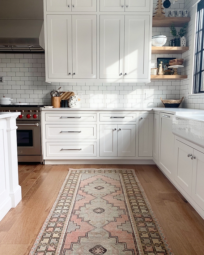
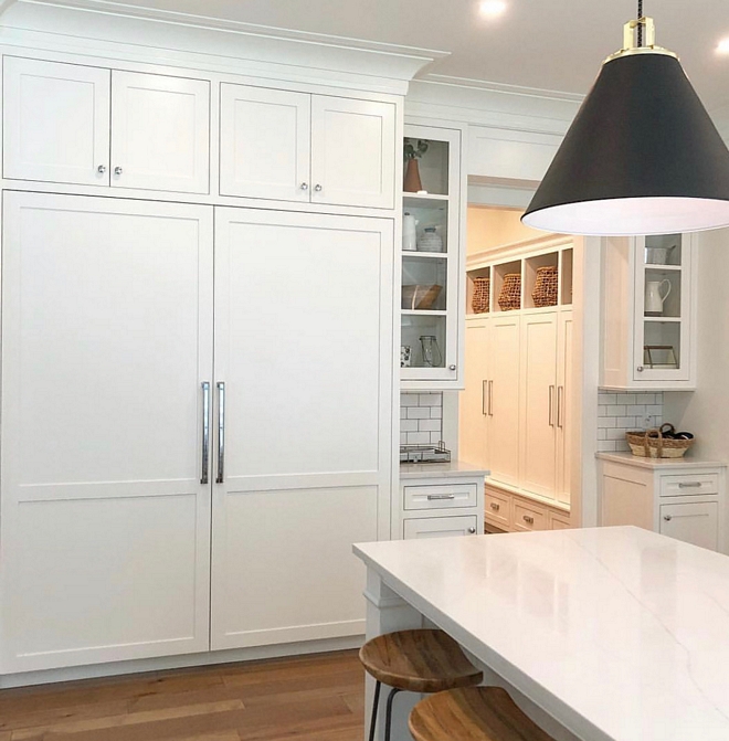
Cabinets: Custom Inset Shaker Cabinetry by Fehrenbacher Cabinets.
Stove: Wolf.
Pot filler: Delta.
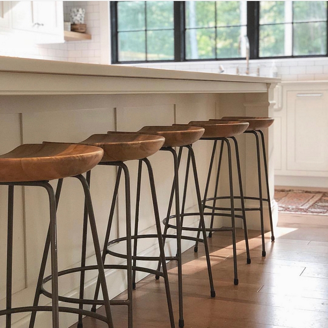
Counterstools
Bar stools: West Elm.
Practicality
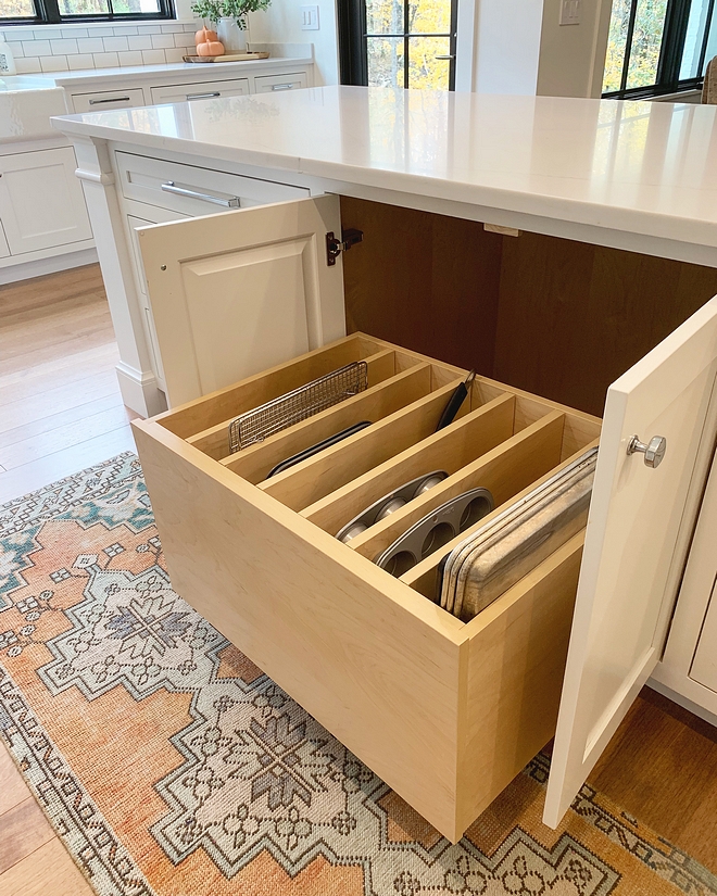
I wanted our kitchen to be a really functional space. Functional storage was a must. I added more drawers instead of door cabinets because I feel they are easier to get to and things don’t get lost in the back of a cabinet.
Smart Thinking!
My favorite thing about my kitchen is our pull-out sheet pan drawer. I was so tired of jamming sheet trays and large cutting boards into a tiny cabinet.
Rug: Violet Vintage Rugs.
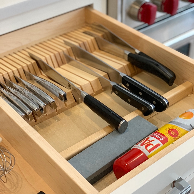
Knives
I added a knife block drawer to help keep my counter clutter free!
Cabinetry: Custom – Similar Option: Here & Here.
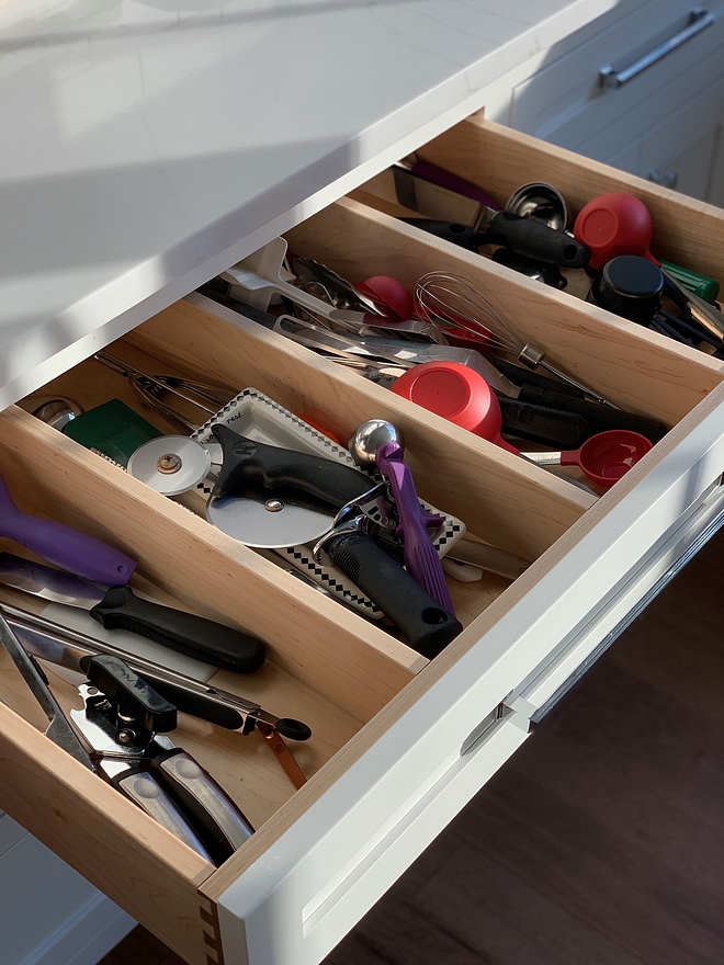
Utensils
We added utensil dividers so all the utensils don’t get tangled. It helps keep things more organized.
Cabinetry: Custom – Similar Option: Here.
Kitchen Windows
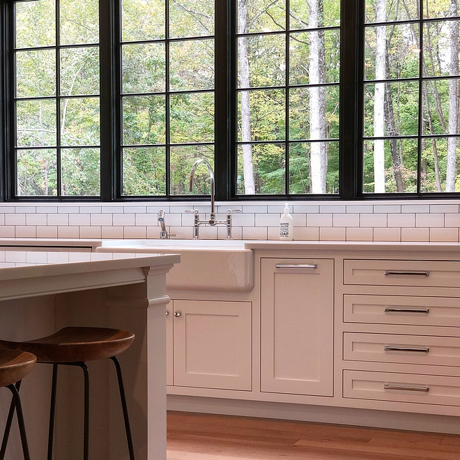
The kitchen windows were a must have. I wanted to be able to see my kids in the backyard, watch the deer each morning, and let as much light in as possible. We wanted the outside to be pulled into our home as much as possible.
Kitchen Sink
Kitchen sink is by Kohler .
We also added a servo drive unit to our trash can so all you have to do is barely nudge it with your knee, hip, etc and it pops open. Great when your hands are dirty or full when you’re cooking and cleaning.
Kitchen Faucet
Kitchen Faucet: Kohler.
Backsplash
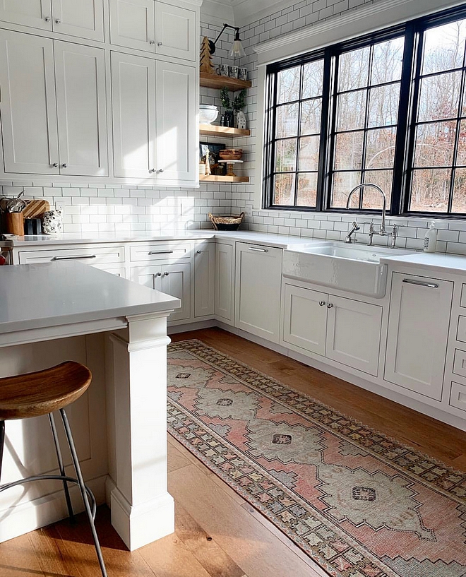
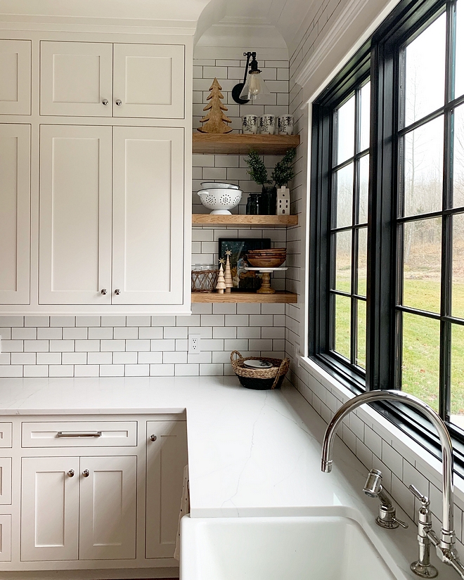
I wanted our space to feel light and bright so we chose white cabinets, and knew the windows would pop. I decided to tile the whole wall to create a focal point!
Backsplash: Discount Glass Tile Store – Subway tile backsplash- 3×6 matte white (similar). Grout: French Grey.
Kitchen Shelves
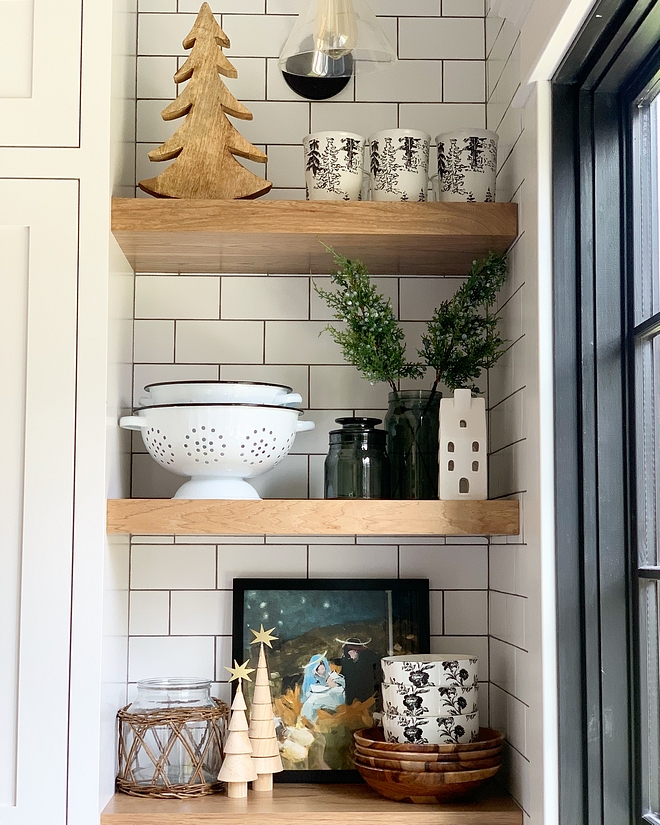
Floating shelves: Hickory custom stained/built to match floors. – similar here & here.
Sconce above floating shelves: Schoolhouse Princeton Long Sconce.
Kitchen Hardware
Hardware: Atlas, Sutton Place Pull & Atlas, Browning Knob.
Countertop
Countertops: Aureastone Quartz, Lincoln.
Paneled Refrigerator
We chose to hide our fridge and freezer with a panel, making everything look like cabinetry.
Fridge/Freezer: Sub-Zero, 36 in.
Mudroom
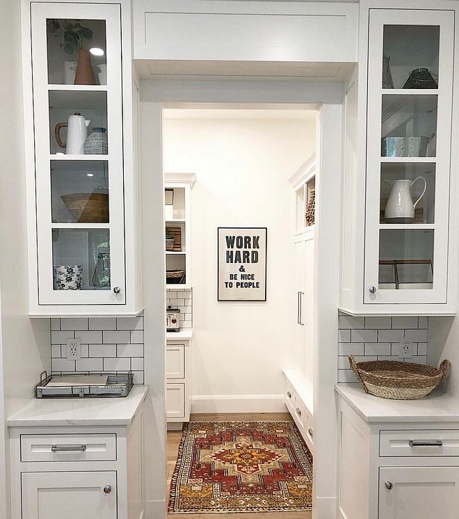
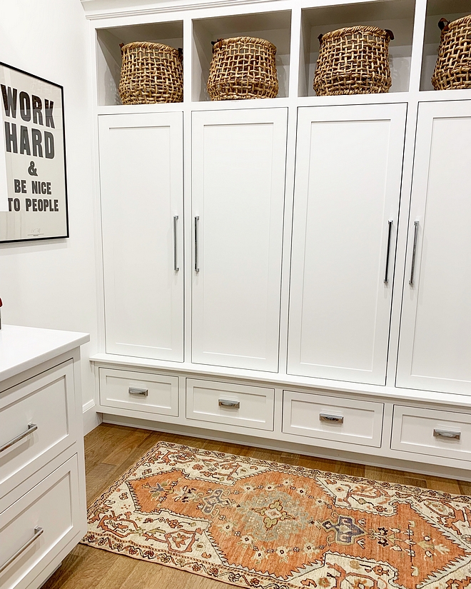
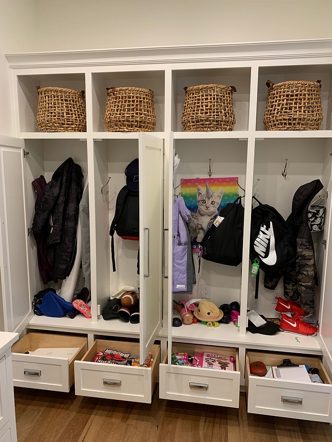
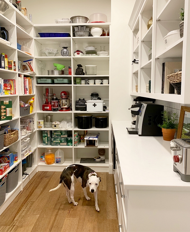
This may be our most functional space in our home. We combined a mudroom with pantry to create almost an extension of our kitchen.
Rugs: www.violetvintagerugs.com
Print: Schoolhouse.
Lockers
The lockers were a must have with kids, and especially adding doors to them.
Cabinet Paint Color: Benjamin Moore Chantilly Lace.
Baskets above cubbies: Target (no longer available) – similar here & here.
Hardware: Atlas, Sutton Place Pull & Atlas, Drawer cup pulls.
Kids Stuff
The insides are always messy, but at least with the doors that space stays looking clutter free. We added drawers on the bottoms for shoes, art supplies, and knick knacks. I’m all about hiding my mess. We also added an outlet in each locker for electronic charging!
Similar Hooks: Here.
Pantry
The shelves with all of the food are hidden on the other side of the wall so unless you physically walk into the pantry you can’t see all of the food mess. 
We placed a countertop in here to keep our kitchen counters from being cluttered with appliances, like a toaster and mixer. We also added big drawers underneath for easy snack access for the kids.
Our coffeemaker is in the pantry, and one thing we did was add a water line to the coffee maker so we never have to fill it with water.
Food storage bins: Target.
Coffee Maker: Keurig B150P.
Countertop: Aureastone, Lincoln .
Shelves
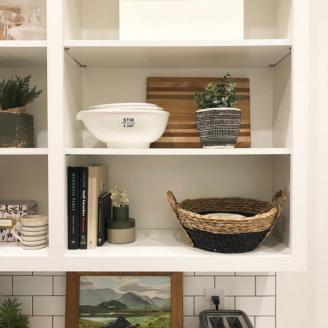
Because we opted to eliminate the door to the pantry, I wanted functional open shelving since you could see into the pantry from the kitchen. I wanted to be able to display pretty dishes and bowls, while still having easy access to them.
Study
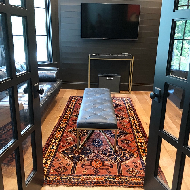
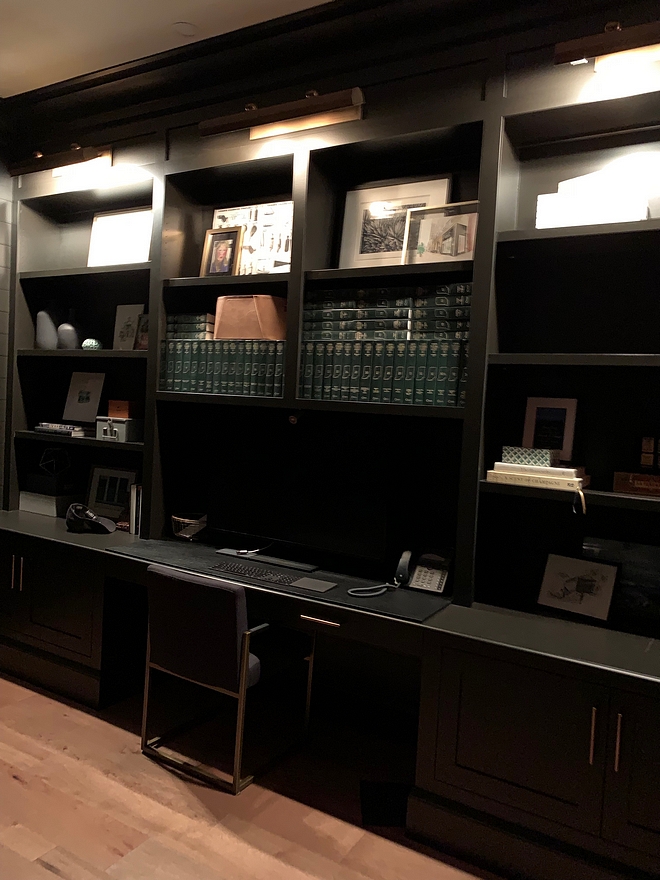
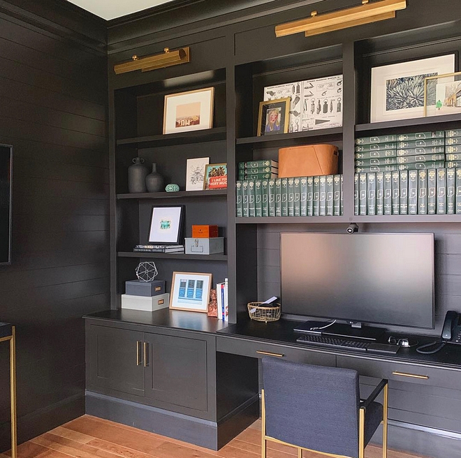
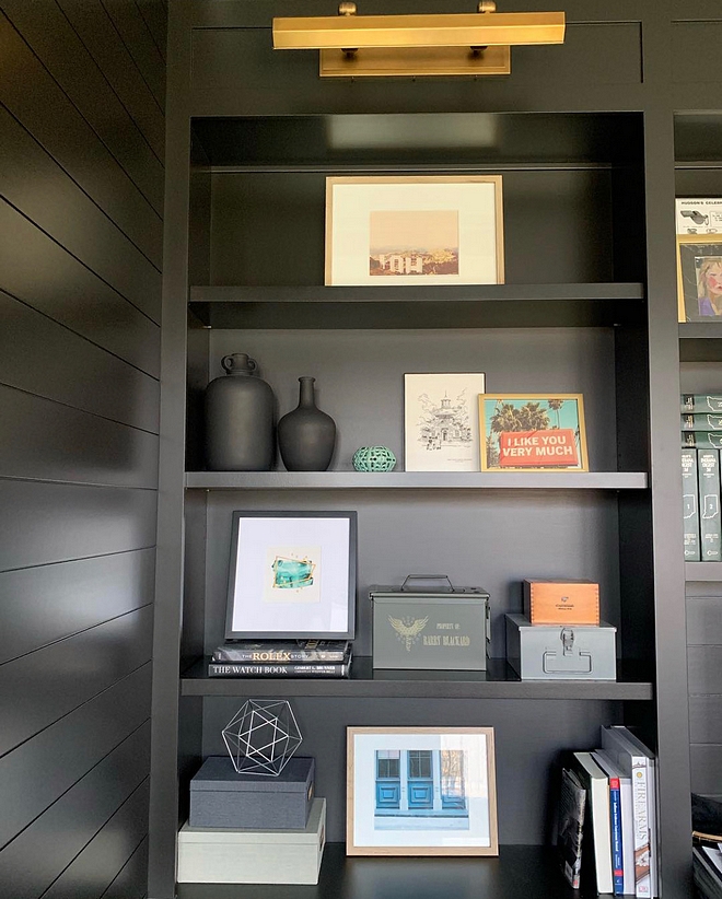
The one room in our house that isn’t white, is my husband’s office. I can still remember when he told me he wanted it black, and I thought he was crazy. Now I’m glad I listened to him. The walls are shiplapped in Sherwin Williams Black Magic.
Rug: Violet Vintage Rugs.
Door Hardware – Emtek Hardware.
Cabinetry
We chose brass fixtures to accent the black. We put the printer on a rollout to hide it inside the cabinet.
Black & Brass
We chose brass fixtures to accent the black. We put the printer on a rollout to hide it inside the cabinet.
Hardware: Restoration Hardware, Spritz pull brass – similar here.
Library Lights
Library lights: Restoration Hardware – similar here, here & here.
Laundry Room
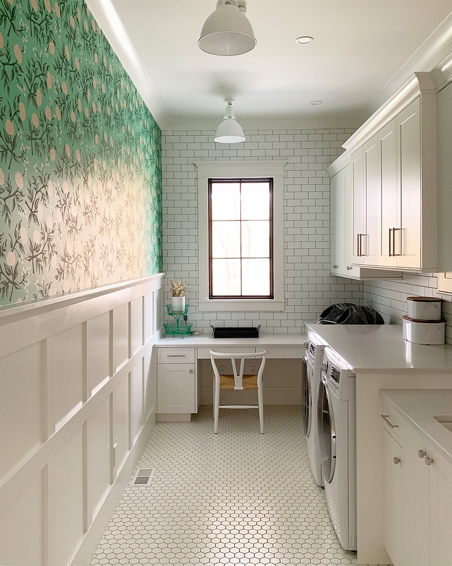
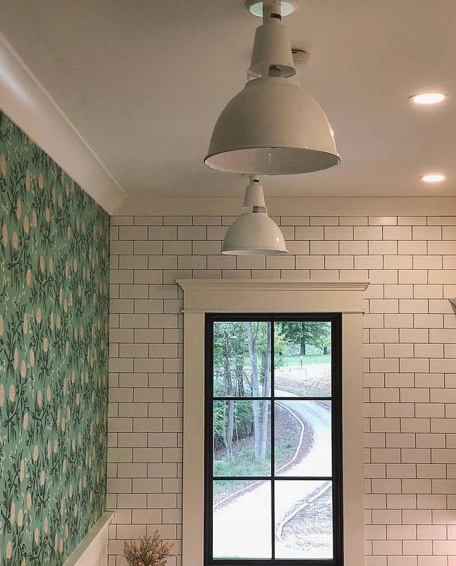
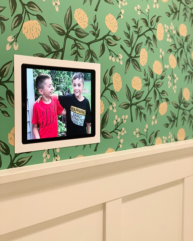
Having a large laundry room was a must-have for us. I feel like I live in here (as most moms can relate), so I wanted it to be bright and colorful. I chose a cheery green wallpaper, and love that I have a desk where I can do work while I’m working on laundry.
I wanted laundry basket cubbies where I can store clean laundry to be put away and I also needed a utility sink where I can bathe our hairless cats and use for laundry.
Laundry Wallpaper: Discontinued – Other Beautiful Wallpaper: here, here & here.
Laundry Chair: Target.
Flooring: Hex Matte White Tile – similar.
Lighting
Laundry Lights: Schoolhouse.
Subway tile: Same as kitchen – Subway tile backsplash- 3×6 matte white (similar).
Grout color: Delorean grey.
Wall
We also placed our iWallDock on this wall. We use it to control all of the music in our home and for security cameras.
Water Fountain
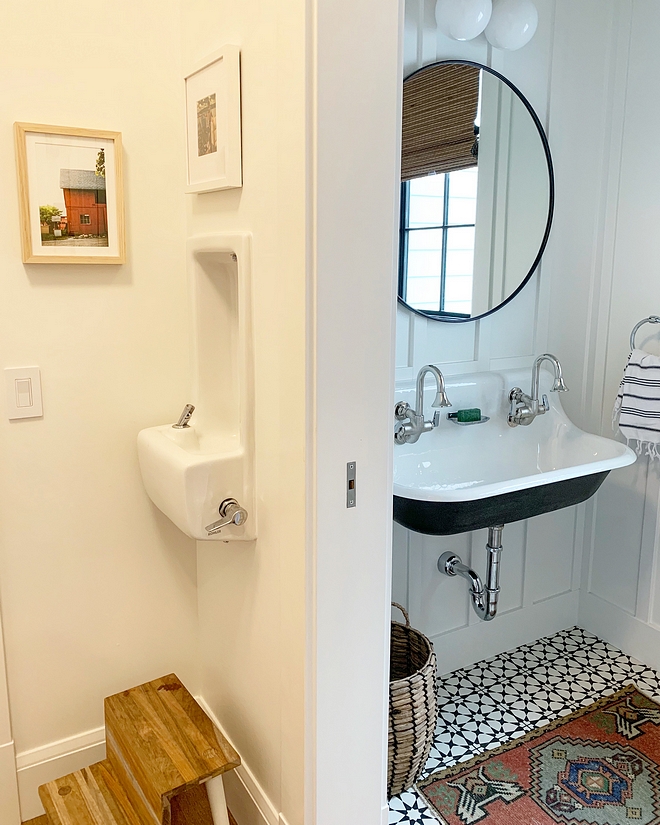
We have a water fountain right outside the door, which is the garage entryway as well. The kids run in, grab a drink, and head right back outside to play! When they are thirsty- I just point ha! We really went for functionality in our home!
Drinking Fountain: Kohler.
Step Stool: Here.
Mirror: Rejuvenation.
Sconce: Visual Comfort.
Powder Room
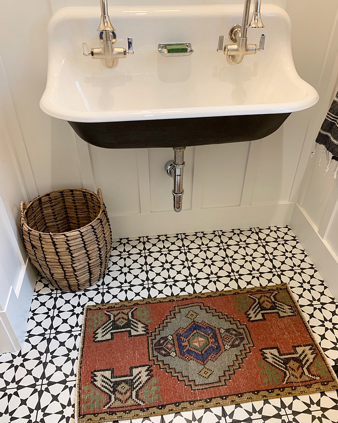
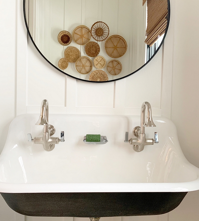
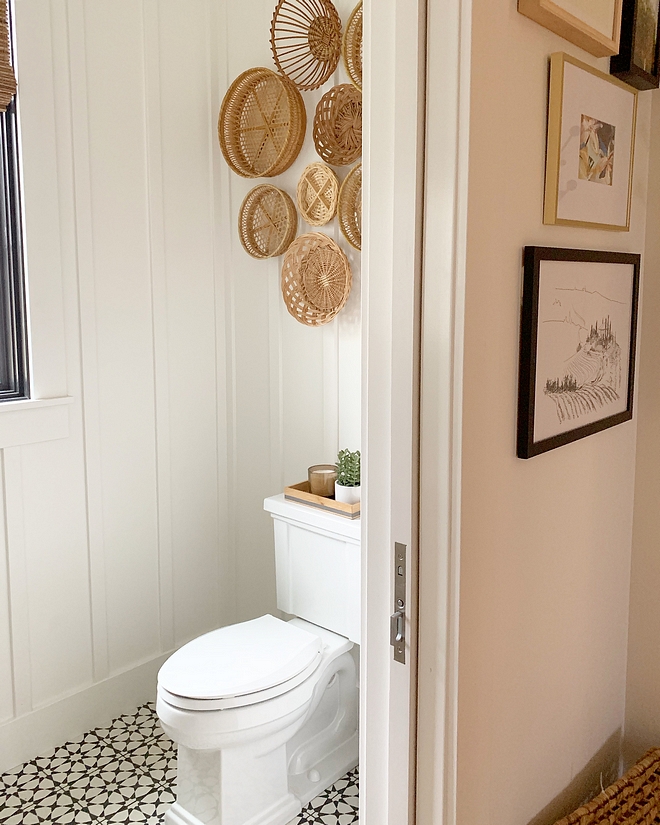
I wanted this to be a fun space since I knew everyone would see it. I added the fun patterned cement tile for some interested, added board and batten to the walls, and a basket wall for some warmth.
Again, I’m always switching out a vintage rug in here. 
Sink
The double Kohler Brockway sink is great for hand-washing before dinner, especially because it has two faucets!
Sink: Kohler.
Faucets: Kohler.
Soap Dish: Kohler.
Flooring
Flooring: Cement Tile shop – similar here.
Baskets: Etsy.
Boys Bathroom
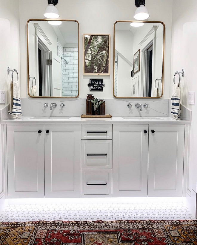
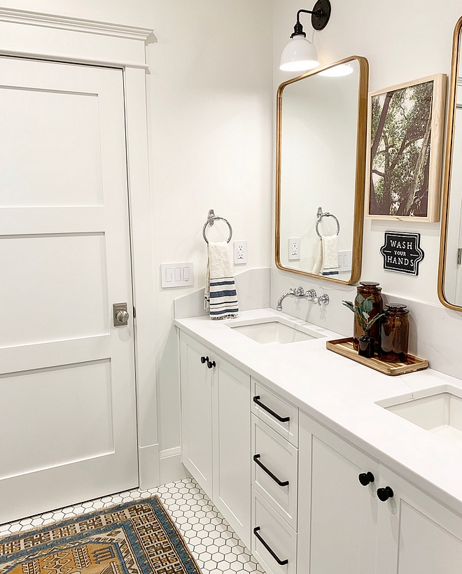
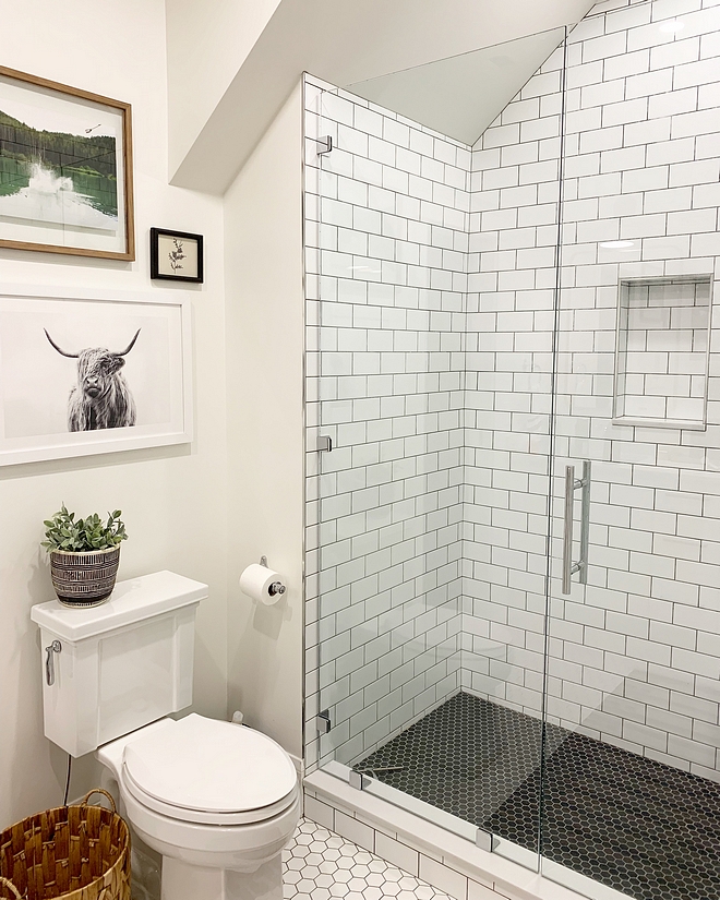
I went for a industrial/modern look in the boys bathroom, using contrasting black tile in the shower, industrial sconces, and black hardware.
I added warmth with a vintage rug and white oak mirrors.
Mirrors: Rejuvenation.
Wash Your Hands Sign: Target.
Vanity Countertop
Countertop: Quartz, Aureastone Lincoln.
Faucets: Rohl.
Lights: Schoolhouse Electric.
Vanity Lighting
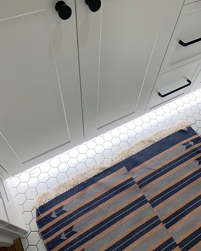
My favorite feature about the vanity is the toe kick lighting that is motion activated. Great for kids in the night!
Toe Kick lighting: Kichler.
Rug: Violet Vintage Rugs.
Shower Tile
Shower floor tile: Discount Glass Tile Store, Black matte hex 1 inch – similar here.
Floor Tile: White 2 inch hexagon tile – similar here.
Shower Faucet: Kohler.
Bull Picture: Wayfair.
Daughter’s Bedroom
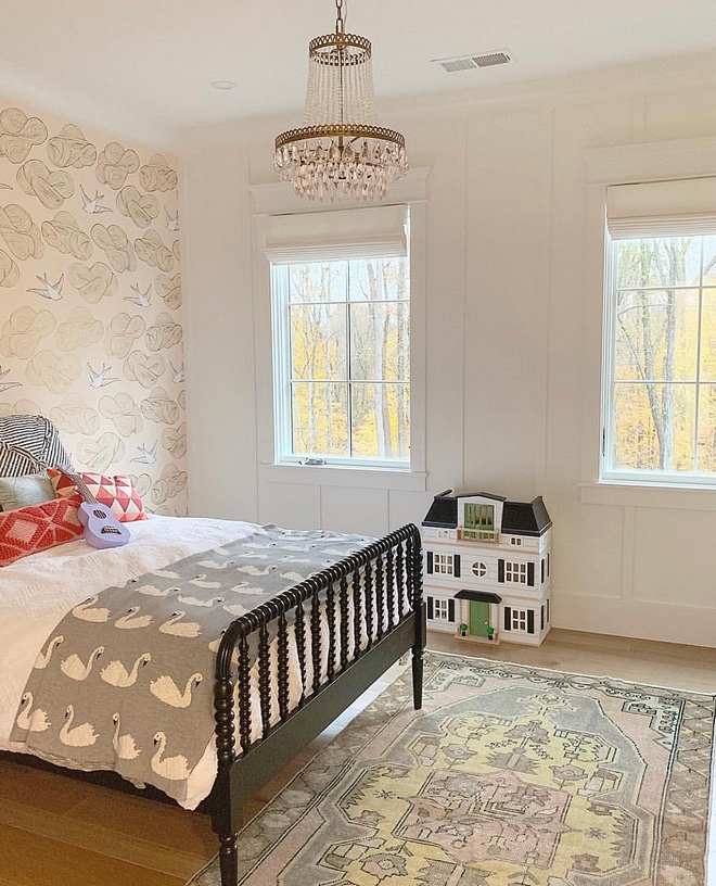
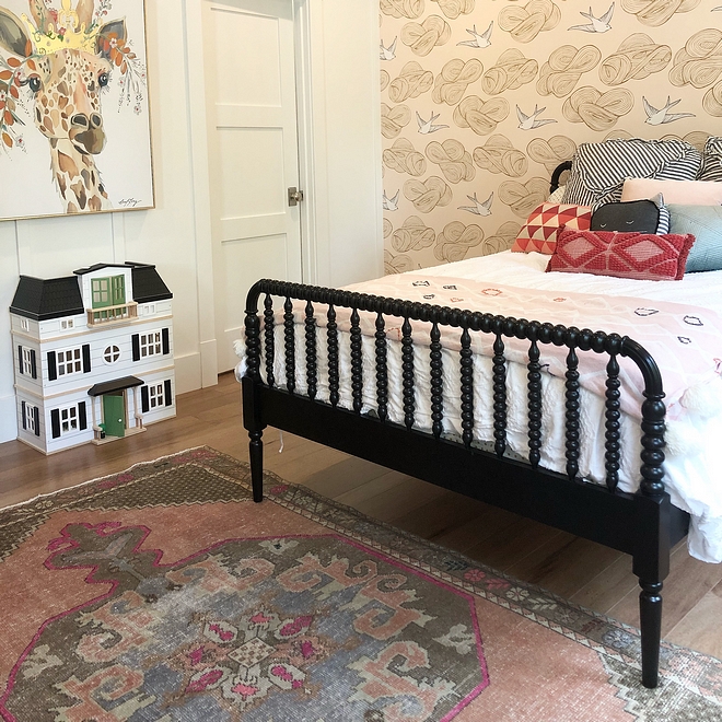
This wallpaper is the star of this room. I wanted her room to have a cheerful and whimsical vibe.
Wall Color: BM Chantilly Lace.
Wallpaper: Hygge and West, Daydream, Blush.
Swan Blanket: Homegoods – Other Beautiful Kids Bedding: Here.
Rug: Violet Vintage Rugs.
Chandelier: Pottery Barn Kids.
Bed
Bed: Crate and Barrel Kids – similar here.
Duvet: West Elm.
Striped Pillows: Pottery Barn.
Other Pillows: Target.
Dollhouse: Hearth and hand Magnolia.
Daughter’s Bathroom
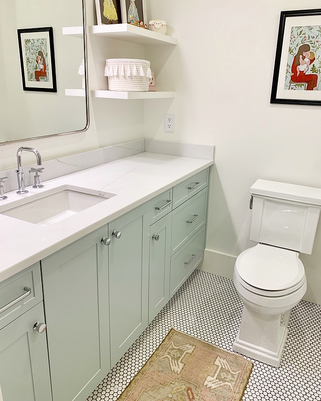
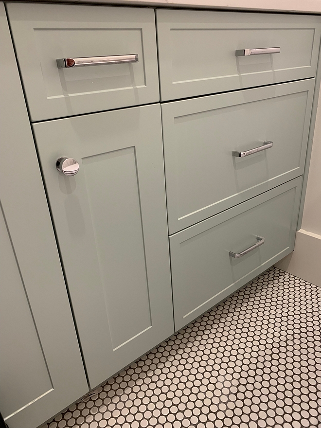
My daughter’s bathroom was the only room with a colored vanity. I loved this retro blue and it inspired me to go with a retro vibe in her bathroom. Cabinet paint color is Benjamin Moore Woodlawn Blue.
Flooring: White Penny Tile.
Grout Color: Dark Grey.
Mirror: Rejuvenation.
Sconce: Schoolhouse Electric.
Art: Lynne Millar.
Faucet: Kohler.
Cabinet Hardware
Cabinet Hardware: Pulls & Knobs.
Master Bedroom
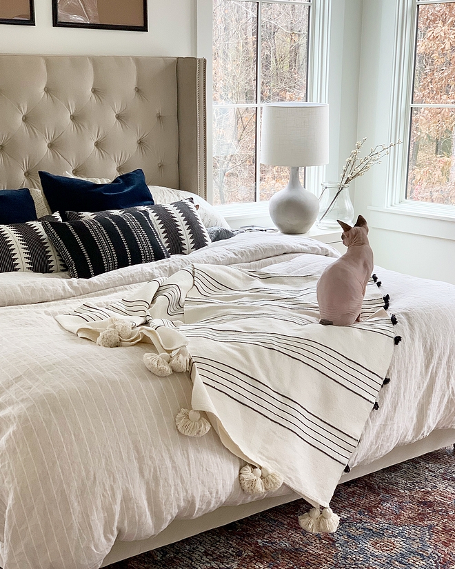
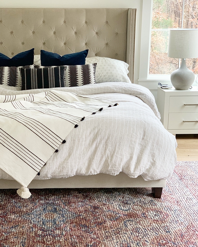
We wanted our bedroom to feel calm and serene. We also don’t have shades on our windows since we live in the woods. The sunlight is our alarm clock.
Throw: Mcgee and Co.
Bed & Bedding
I love to add textures on my bed as well- cotton, linen, velvet- give me it all!
Bed: From local furniture company – similar here, here & here.
Duvet Cover: Arhaus.
Side table: Wayfair.
Lamp: Pier One.
Rug: Loloi.
Ceiling
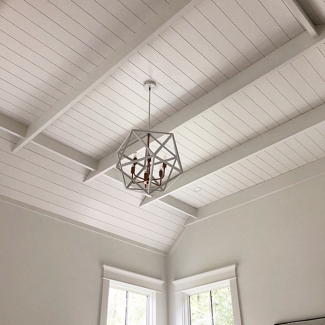
The ceiling was intended to mimic a barn ceiling to help bring in that farmhouse feel.
Lighting: Wayfair.
Master Bathroom
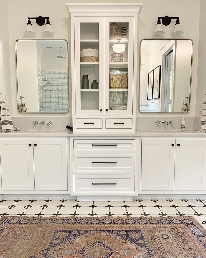
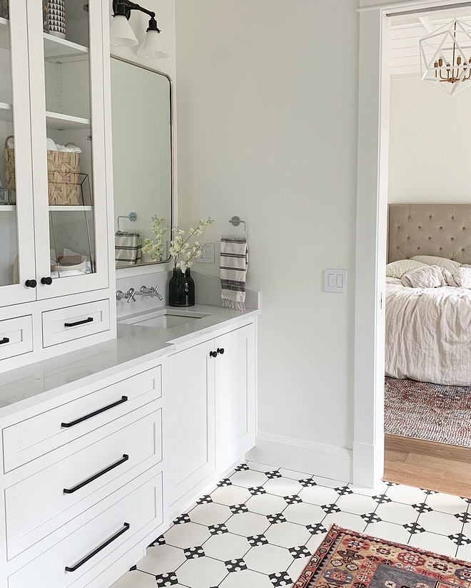
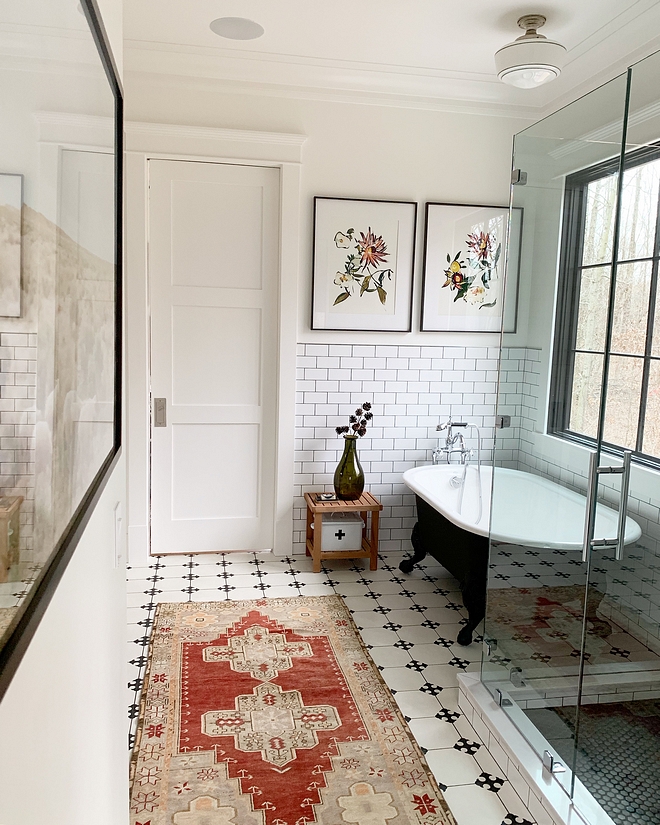
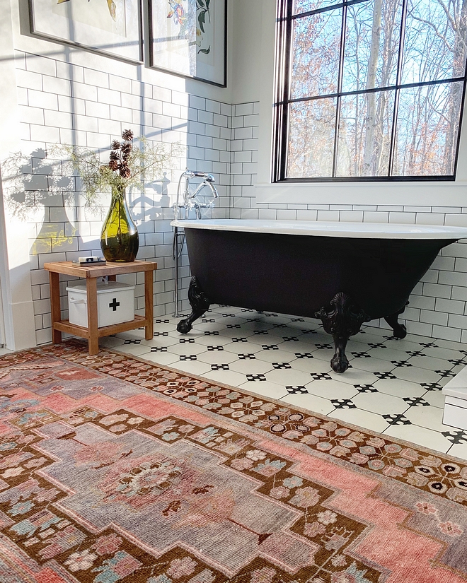
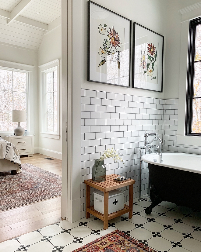
I always have a vintage rug in here to add character and I wanted something unique for our flooring.
We chose wall mounted faucets for the modern look and easy clean up!
Vanity lights: Schoolhouse Electric.
Cabinets: Custom inset cabinets by Fehrenbacher Cabinets in Chantilly Lace by Benjamin Moore.
Mirrors: Rejuvenation.
Sinks: Kohler.
Faucet: Kohler.
Cabinet Hardware
I wanted to mix metals in here so I did black metal hardware and lighting, but kept our fixtures chrome.
We put an outlet in the drawer for the hairdryer, etc.
Countertops: Aureastone, Lincoln.
Vanity Hardware: Knobs & Pulls.
Towel Rings: Delta.
Towels: Mcgee and Co.
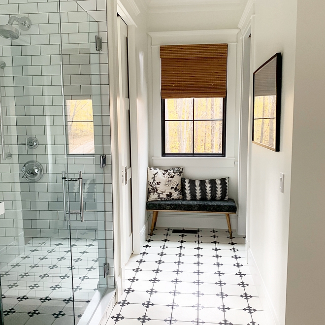
Floor Tile
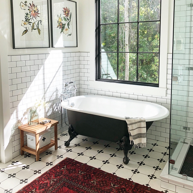
Tile: Cle Tile, Cross Encaustic Cement Tile.
Shower Wall Tile
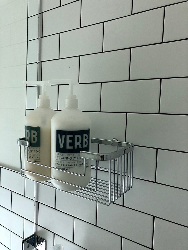
Wall Tile: Discount Glass Tile Store – Subway tile backsplash- 3×6 matte white.
Shower floor tile: Black matte hex 1 inch – similar here.
Tile Wainscoting
The master bathroom also features a subway tile wainscoting.
Light above tub: Schoolhouse Electric.
Tub
We knew we wanted a clawfoot tub to add that vintage feel.
Bathtub: Kohler.
Tub faucet: Kohler (discontinued) – similar here.
Vintage Runner
Vintage runner is from Kristy’s shop; Violet Vintage Rugs.
Artwork
Prints: Juniper Print Shop – Frames: Cb2.
Playroom
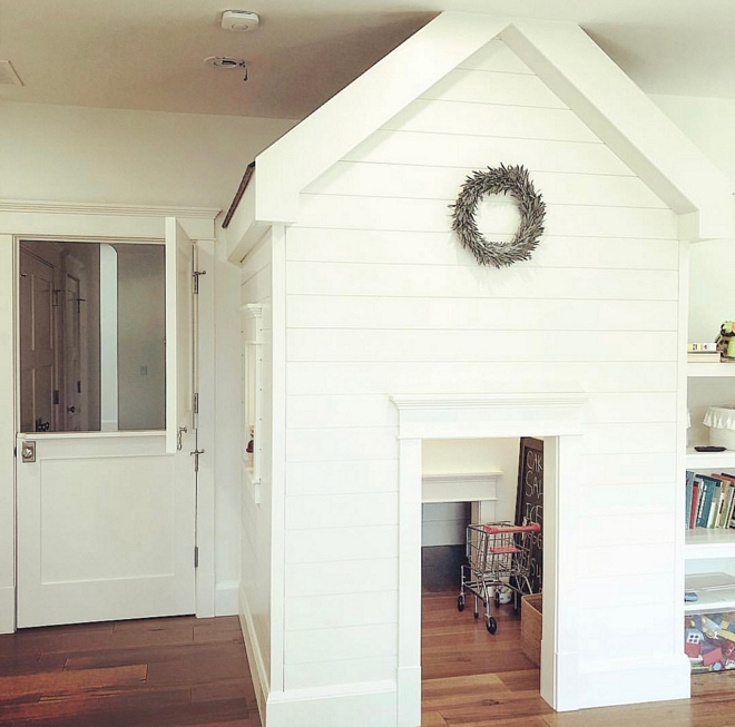
During framing we had a weird wall in the playroom area, and it just had the roofline of a dollhouse in my imagination. It inspired us to build this little playhouse in our playroom for our daughter. I love decorating it for all of the seasons.
Outdoor Fireplace
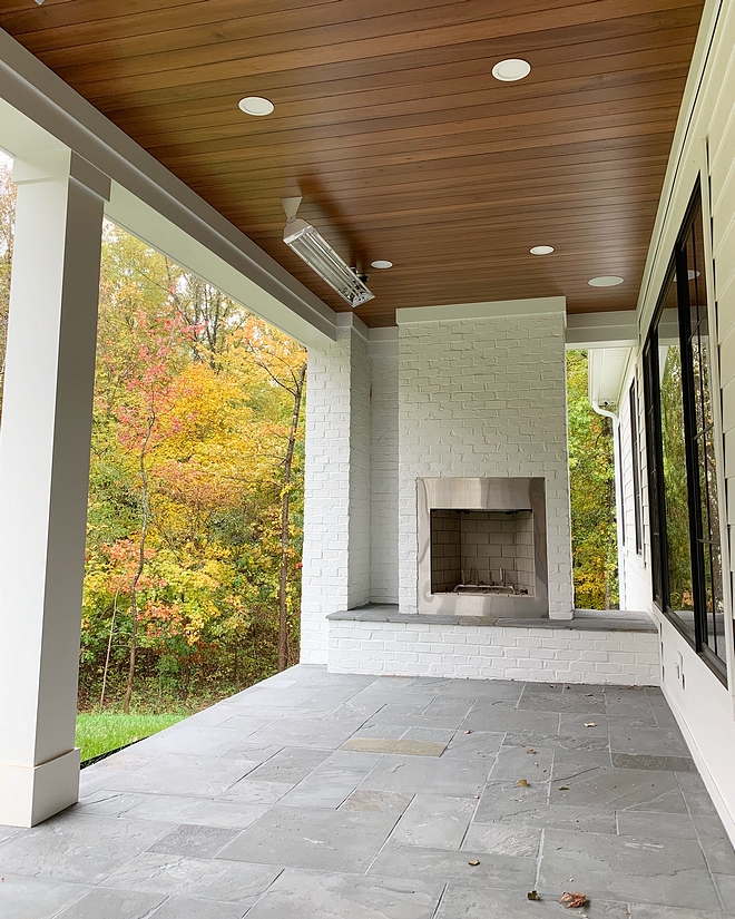
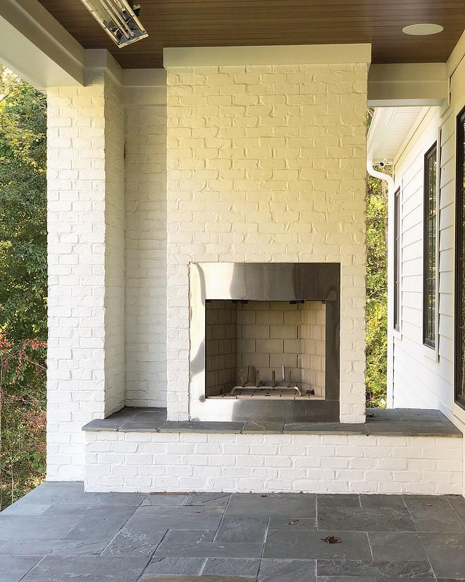
We originally had planned to put a fireplace inside our living room, but I really wanted to let more natural light into our living room. So, we ended up moving our fireplace to our back porch and replacing it with a giant picture window. Now we love having all of the natural light in our living room, and the fireplace outside has been an amazing addition.
Cozy
With the electric ceiling heaters, plus the fireplace we can use our porch year round.
Home-Sweet-Home
I love being surrounded by all of the trees.. watching the trees bloom, watching the leaves change, and watching the snow fall.
Making Memories
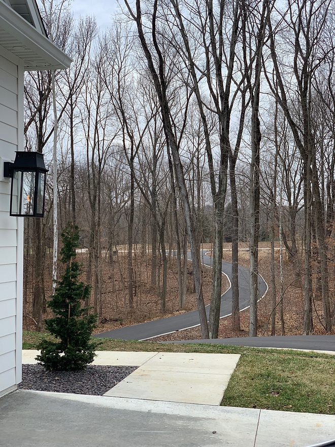
Our long winding driveway is something I always envisioned my home having. I love that my kids can go exploring in the woods, our dog can roam our property, and I can watch the deer each morning through the kitchen windows.
Many thanks to the super-talented Kristyn for sharing all of the details above!  Make sure to follow Kristyn on Instagram to see more of her beautiful home and visit her vintage rug shop!
Have a Blessed week, my friends!!!
Best Sales of the Month:
Thank you for shopping through Home Bunch. I would be happy to assist you if you have any questions or are looking for something in particular. Feel free to contact me and always make sure to check dimensions before ordering. Happy shopping!
Serena & Lily: Free Shipping on Everything with code: NEWGOALS
Wayfair: Massive Rug Sale! Up to 75% OFF!
Joss & Main: Up to 80% Off on Clearance
Pottery Barn:Mega Sale: Up to 60% OFF Plus Free Shipping
West Elm: New Items on sale – Free Shipping with code: FREERIDE
Horchow: Free Shipping with code: FREESHIP
Anthropologie: Extra 50% OFF Sale Items!
Posts of the Week:
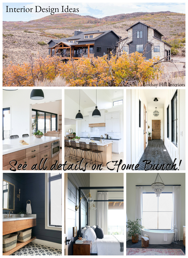
Interior Design Ideas: Home Renovation.
2019 New Year Home Tour.
 Belgian-style Modern Farmhouse.
 Stone Cottage-style Home Design.
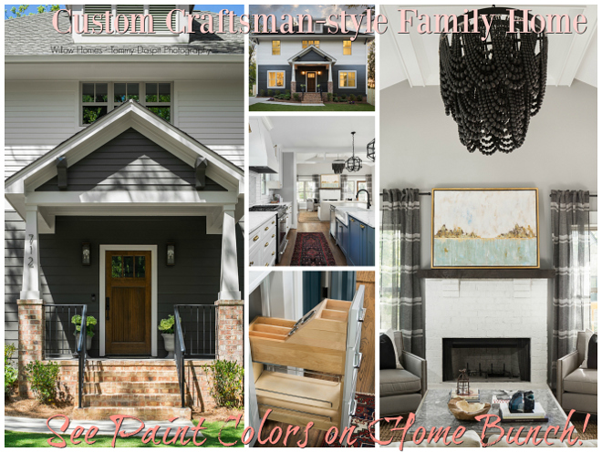
Custom Craftsman-style Family Home.
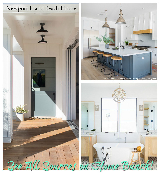
 Newport Island Beach House.
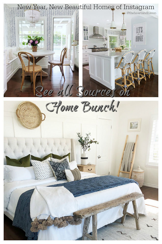
New Year, New Beautiful Homes of Instagram.
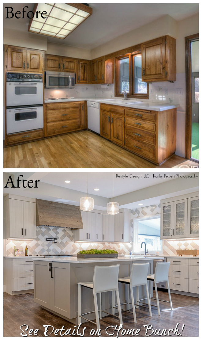
Before & After Home Renovation.
 California Duplex Home Design.
 Stone Lake House.
Australian Beach House.
 Family-friendly Home Design.
 Beautiful Homes of Instagram: Canada.
 Beautiful Homes of Instagram.
 Georgian-Style Manor with Traditional Interiors.
 Transitional Home Design.
Interior Design Ideas.
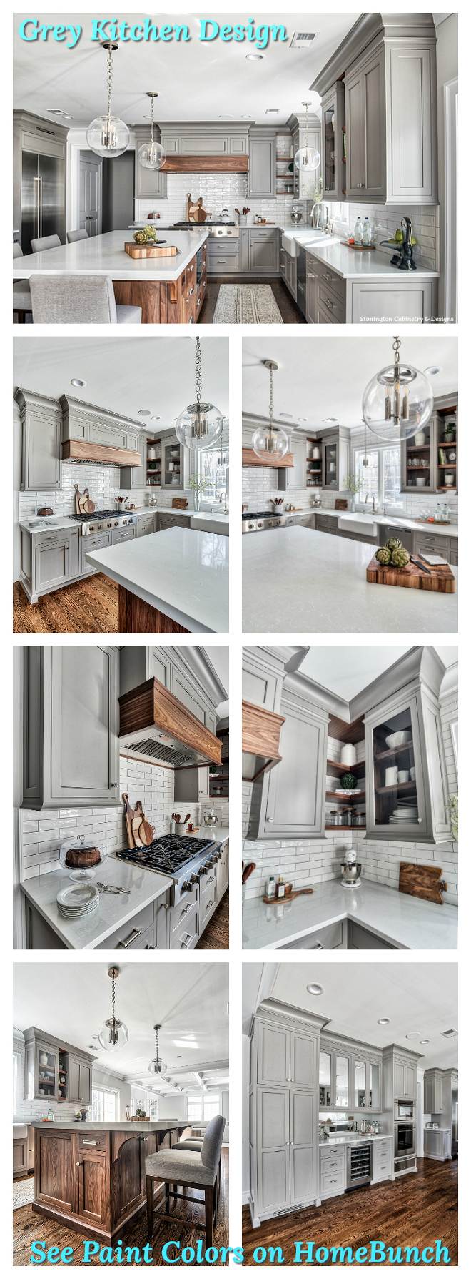
 Grey Kitchen Paint Colors.
 Beautiful Homes of Instagram: California Beach House.
Follow me on Instagram: @HomeBunch
You can follow my pins here: Pinterest/HomeBunch
See more Inspiring Interior Design Ideas in my Archives.
“Dear God,
If I am wrong, right me. If I am lost, guide me. If I start to give-up, keep me going.
Lead me in Light and Love”.
Have a wonderful day, my friends and we’ll talk again tomorrow.”
with Love,
Luciane from HomeBunch.com
Get Home Bunch Posts Via Email
“For your shopping convenience, this post might contain links to retailers where you can purchase the products (or similar) featured. I make a small commission if you use these links to make your purchase so thank you for your support!”
Via wildecom builders feed http://www.rssmix.com/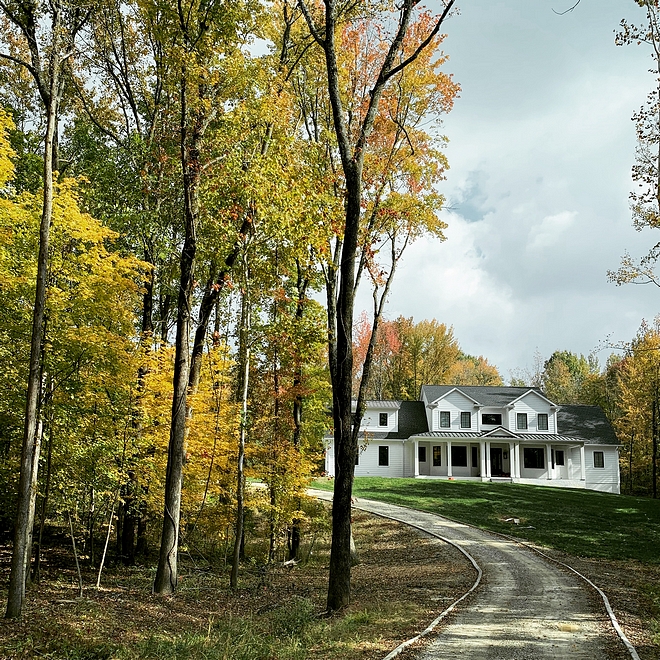







No comments:
Post a Comment